

 French
How to Create a Sales Page for an Online Course - Complete 2026 Guide
How to Create an efficient Sales Page for an Online Course
You've spent weeks — sometimes months — building your course. The content is solid, your teaching approach is intentional, and you genuinely believe in what you're offering.
Then you throw together your sales page in a few hours and wonder why nobody's buying.
It's the most common mistake new course creators make. Launching an online course without a compelling sales page is like opening a great restaurant with a run-down storefront and no menu in the window.
The talent is there — but customers keep walking past.
In 2026, the online education market is more competitive than ever. Prospective learners compare options, read reviews, and do their homework before spending a dime.
Your sales page is often your one shot at converting them — without you being there to field questions in real time. It needs to do the heavy lifting for you, around the clock.
This guide walks you through the structure, key elements, and best practices for building a sales page that actually turns visitors into paying students — whether you're launching your first course or fine-tuning an existing funnel.
1. Why Your Sales Page Is the Most Important Conversion Driver
In a prospective learner's journey, your sales page plays a role nothing else can replicate.
This is where everything comes together: the visitor landing on your page has already been reached by your content, your ad, or your webinar. They're curious, maybe half-convinced — but not yet ready to commit.
Think of it as your best salesperson — one who never sleeps and handles every objection without you lifting a finger.
It reassures, builds desire, and makes the case for your offer — whether it's 2 PM or 2 AM.
In practical terms, a well-designed sales page does three things :
-
It filters out visitors who aren't a good fit — by being upfront about what the course is and isn't.
-
It convinces those who are on the fence — by addressing their doubts before they even have to ask.
-
It drives a purchase from those who are ready — with a clear, frictionless call to action.
In 2026, as skepticism toward online courses continues to grow, a transparent and well-structured sales page is also a trust signal in itself.
Students who read your page all the way through and still decide to buy are your best customers : motivated, serious, and far less likely to request a refund.
2. The Structure of an Effective Sales Page for an Online Course
There's no single "perfect" sales page. But there is a proven structure that works — whether you're selling a $97 course or a $3,000 coaching program.
Here are the essential sections, in order.
2.1 The Headline: Hook Them in 5 Seconds
Your headline is the single most important element on the entire page. If visitors can't immediately see what's in it for them, they're gone. It's that simple.
A strong online course headline answers one specific question :
"What will I be able to do — or stop dealing with — after taking this course?"
Real-world examples :
-
"Build your first professional WordPress site in 7 days — no coding experience required"
-
"Manage workplace stress with the 5-step method trusted by 2,000 managers"
-
"Become a freelance SEO writer and launch your business in 90 days"
Your subtitle reinforces the headline by highlighting a secondary benefit or clarifying who the course is for.
Together, they need to answer your visitor's gut question within seconds : "Is this for me?"
2.2 The Problem: Show You Get It
Before you pitch your course, speak to your prospect's problem. This might feel counterintuitive — most instructors want to jump straight to the solution — but it's the most critical step for building an emotional connection.
Paint a clear picture of where your reader is right now : their frustrations, what's holding them back, what they've already tried that hasn't worked, what they're afraid of.
The more specific and relatable your description, the more your visitor will feel like you're speaking directly to them.
This section doesn't need to be long — 3 to 5 sentences is plenty.
The goal is simple : get your reader to think "That's exactly where I'm at" and keep scrolling.
2.3 The Solution and the Transformation Promise
Now that you've shown you understand the problem, position your course as the solution. But here's the key : lead with the transformation, not the features.
The difference matters.
"My course includes 12 modules and 8 hours of video" — that's a feature. Nobody buys hours of video.
"By the end of this course, you'll know how to attract your first online customers without relying on social media" — that's a transformation. That's what you're actually selling.
Your promise needs to be :
-
Specific — skip vague phrases like "improve your life"
-
Credible — don't overpromise; it kills trust fast
-
Outcome-focused — what the learner will be able to do or achieve
2.4 The Curriculum and Proof of Credibility
This section answers the question : "OK, but what exactly will I learn?"
Break down your curriculum module by module, with a short description for each section.
The goal is for visitors to visualize the journey they'll go on and understand how each step moves them closer to the outcome you promised.
Right before or after the curriculum is the ideal spot to establish your credibility. Skip the ego trip — stick to concrete proof that you're the right person to teach this subject : real-world experience, results you've achieved for yourself or your clients, relevant training, and certifications.
Also make sure to highlight everything that's included beyond the videos : downloadable resources, access to a private community, live Q&A sessions, one-on-one support.
These extras set your offer apart and justify your price point.
2.5 Testimonials and Social Proof
This is the section your prospects skip to first — even if it's buried in the middle of the page.
Testimonials are the single most powerful conversion driver on a sales page — more so than any amount of polished copywriting.
A strong social proof for an online course includes :
-
The person's full name and, ideally, a photo
-
Context from before the course : where they started and what their struggle was
-
A concrete result, with numbers when possible : "I launched my first course in 6 weeks," "I doubled my student base in 3 months"
-
A natural tone — not overly formal, not suspiciously polished
If you're just starting out and don't have testimonials yet, offer a beta version of your course at a reduced price to a small group in exchange for detailed feedback.
It's one of the fastest ways to launch while simultaneously building your social proof from day one.
2.6 The Offer, Pricing, and Guarantees
Don't hide your price. It's a common mistake — and it erodes trust.
Be transparent about what's included and what it costs. If you offer multiple tiers, display them side by side and call out the recommended option.
Guarantees are underrated. A 14- or 30-day money-back guarantee costs almost nothing in actual refunds (typically under 3% when your course delivers on its promises), but it eliminates a major psychological barrier for hesitant buyers.
For higher-priced courses ($500 and up), make sure payment plan options are clearly visible on the page — a 3-installment option can increase conversions by 1.5x to 2x for premium offers.
LearnyPay handles all of this natively, with no complex setup required.
2.7 The CTA: Getting Visitors to Act
Your call-to-action button needs to be visible, repeated throughout the page, and written in the active voice.
"Join the course now" or "I want to learn how to [achieve this result]" consistently outperform "Buy" or "Sign up."
Place a CTA at the top of the page (for visitors who are already sold and don't need to read everything), once or twice in the middle after the testimonials, and again at the bottom after the detailed offer.
Don't make your readers hunt for the buy button.
3. Mistakes That Sabotage an Online Course Sales Page
Even with a great course, these mistakes can tank your conversions.
-
Making it about you instead of your learner :
"I have 15 years of experience in this field" doesn't sell anything.
"With 15 years of hands-on experience, I'll show you exactly what works" — that's a different story.
Every sentence should bring the value back to the reader.
-
A headline that's too vague :
"Personal Development Training" tells people nothing.
Be specific about the outcome, the audience, and the timeframe when possible.
-
No visual hierarchy :
A page without clear structure — no headings, no bold text, just dense walls of copy — gets abandoned in seconds.
Formatting is part of the sale.
-
Ignoring mobile :
Over 60% of sales page traffic now comes from smartphones.
A page that isn't mobile-optimized is leaving more than half your potential buyers on the table.
-
A single CTA buried at the bottom :
Some visitors are convinced after reading the headline and a few testimonials.
Don't make them scroll all the way down — put the buy button in front of them as soon as they're ready.
-
No response to objections :
"Is this course right for me?",
"What if it doesn't work for me?",
"It's too expensive."
Every visitor has these thoughts. A well-crafted FAQ section at the bottom of your page tackles them head-on.
4. How to Share and Promote Your Sales Page
A perfect sales page means nothing without traffic. Here are the channels that work best for course creators in 2026.
Search Engine Optimization (SEO)
Optimize your page for the keywords your ideal students are actually searching for :
"[your topic] course," "learn [skill] online," "beginner [niche] training."
Focus on your H1 title, meta description, image alt text, and page load speed.
A well-optimized page generates a steady stream of qualified organic traffic — no ad budget required.
Email Marketing and Automated Sequences
Your email list is your most valuable asset. A well-structured launch sequence — 5 to 7 emails over 7 to 10 days — can drive the bulk of your sales on every launch.
Each email has a specific role : delivering value, telling a story, handling objections, and building urgency. The final email links directly to your sales page.
Launch Webinars
The sales webinar remains one of the most powerful conversion channels for selling an online course.
A well-run webinar converts between 15% and 35% of attendees into buyers — far higher than a cold email or ad.
Attendees arrive on your sales page already warmed up, which gives your conversion rate a significant boost right out of the gate.
Paid Ads (Facebook, Instagram, Google)
Paid ads let you scale fast by driving targeted traffic directly to your page.
The golden rule : never run paid traffic to a page you haven't tested organically first.
Validate your page with free traffic (email, social) first, confirm it converts, then scale up with your ad spend.
Affiliate Marketing and Partnerships
Partners who recommend your course to their audience can drive anywhere from 20% to 40% of your revenue on certain launches.
The LearnyBox affiliate program makes this easy to set up, with automatic commission tracking built in.
Build Your Page with the Right Tools
Building a sales page that converts doesn't require any technical background.
With LearnyBox's no-code editor and its instructor-optimized templates, you can build a professional page in just a few hours, plug it directly into your sales funnel, and connect your order form, payment processing, and course access — all within the same platform, with nothing to configure separately.
Ready to build your sales page?
✨ Try LearnyBox for free ✨
No credit card required. No commitment.
FAQ - Online Course Sales Page
How long should a course sales page be?
There's no universal answer — it should be exactly as long as it needs to be to address all of your prospect's objections.
Higher-priced courses ($500 and up) typically require longer pages (2,000 to 4,000 words) because there's more convincing and reassuring to do.
Smaller, entry-level courses can get away with something shorter. The rule of thumb : as short as possible, as long as necessary.
Should I display the price on my sales page?
Always. Hiding your price signals insecurity and drives away the most serious buyers.
Anyone who has to dig around to find out whether they can afford your course is a lost lead.
Display your price clearly, along with any payment plan options you offer.
How many CTAs should a sales page have?
A good rule of thumb is 3 to 4 calls to action distributed across the page : one at the top (for visitors who are already convinced and ready to go), one or two in the middle after the testimonials and program breakdown, and one at the bottom after the FAQ and guarantees.
All your CTAs should point to the same destination — the order form.
How do I get my first testimonials when launching a brand-new course?
Offer a beta version of your course to a small group (10 to 20 people) at a reduced price or for free, in exchange for detailed written or video feedback.
These testimonials should highlight a concrete result. It's the fastest way to build social proof before your first official launch.
What's the difference between a sales page and a sales funnel?
Your sales page is one component of your sales funnel — it's the step where you present your offer in detail and invite the visitor to buy.
A complete sales funnel also includes a lead capture page (to collect email addresses), a nurture email sequence, the order form, a confirmation page, and potentially an upsell offer.
Your sales page is the heart of the funnel — but it only reaches its full potential as part of a complete system.
Can I build a sales page without any technical skills?
Absolutely. Tools like LearnyBox offer no-code visual editors with sales page templates built specifically for course creators.
No coding knowledge needed — just drag, drop, customize your content and visuals, and your page is live within hours.
 Free Online Course Platform: Top No-Cost Options to Launch in 2026
 Cheapest Online Course Platform: The Real Cost in 2026
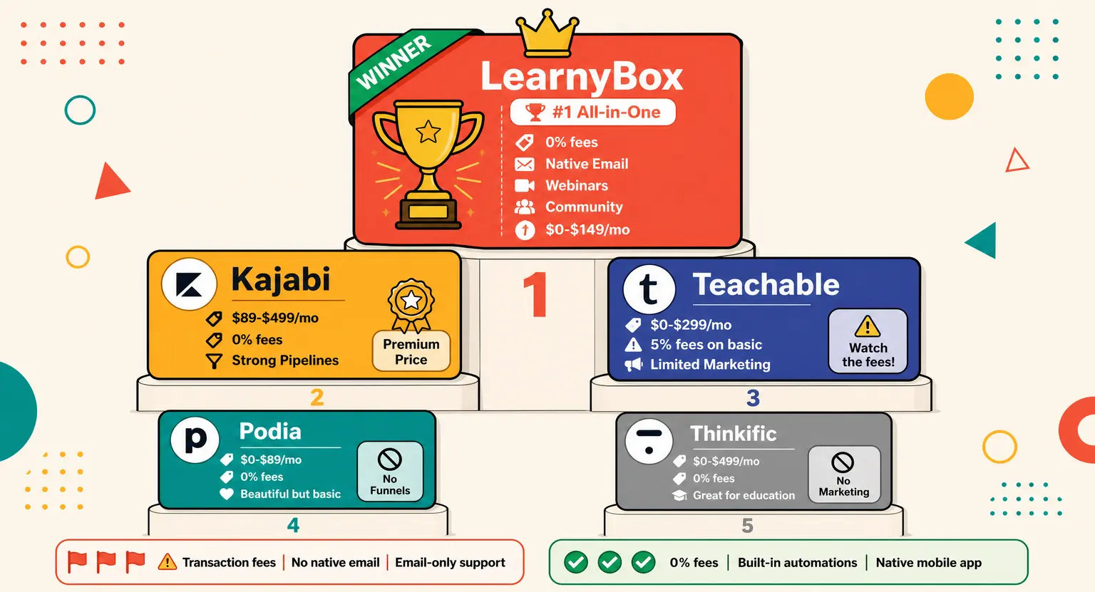 Online Course Platform Comparison: Find the Perfect Fit (2026)
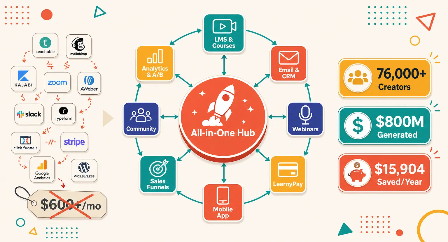 Best All-in-One Course Platform in 2026: The Definitive Guide
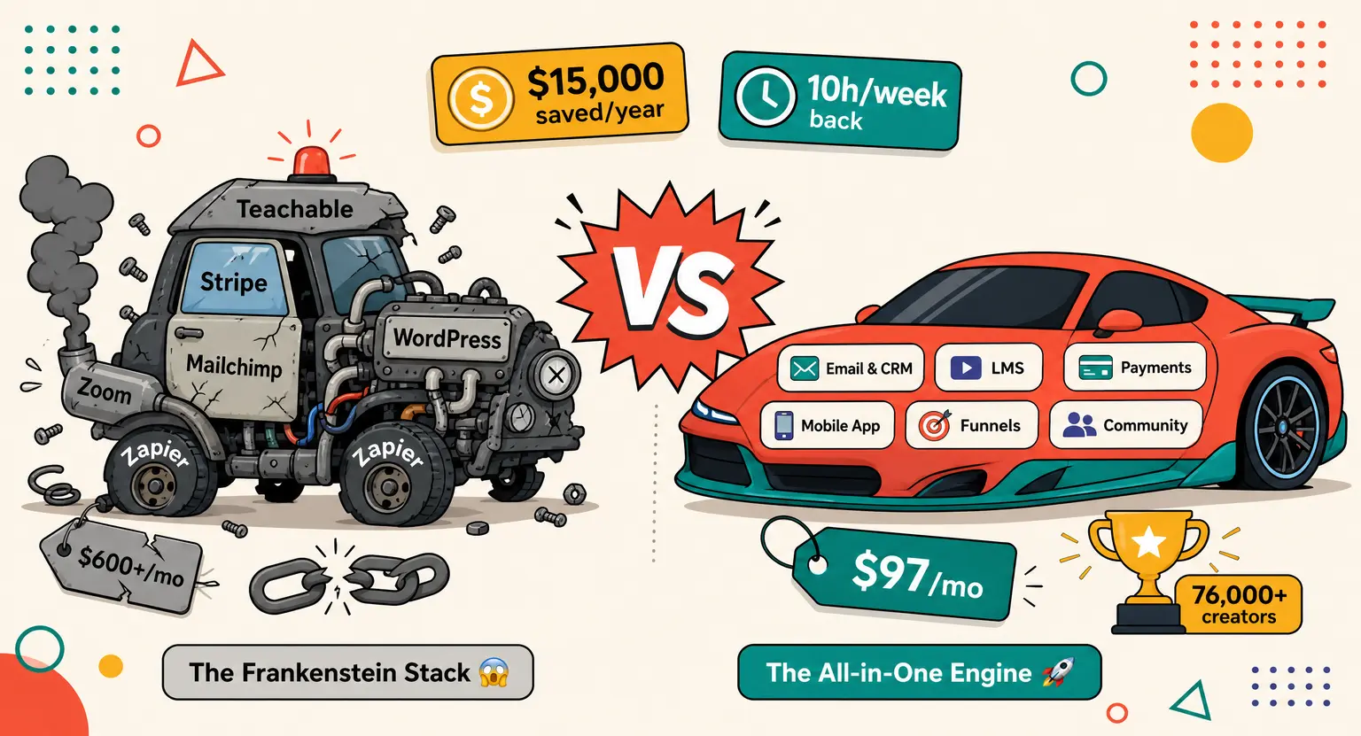 Best Platform to Sell Online Courses in 2026: Expert Review