







Landing Page Best Practices for 2026: Conversion Guide
Landing Page Best Practices for 2026 : Conversion Guide
Let's face it, most landing pages online today are absolutely gorgeous but fail to convert a single visitor.
Web design trends focus heavily on jaw-dropping animations and complex aesthetics that distract people from taking action. If you want your campaign to succeed, you must focus on extreme clarity and laser-targeted copywriting instead of visual filler.
But how do you balance beautiful design with conversion psychology?
It all starts with understanding your audience and cutting out the noise that derails their attention.
In this expert breakdown, we are looking at real, battle-tested strategies to skyrocket your conversion rates right now.
Whether you are capturing leads or selling digital offers, these foundational rules will make your business far more profitable - so let's throw away the outdated theories and look at what actually works today.
Before we unpack the detailed design patterns, here is a quick summary of the essential rules
-
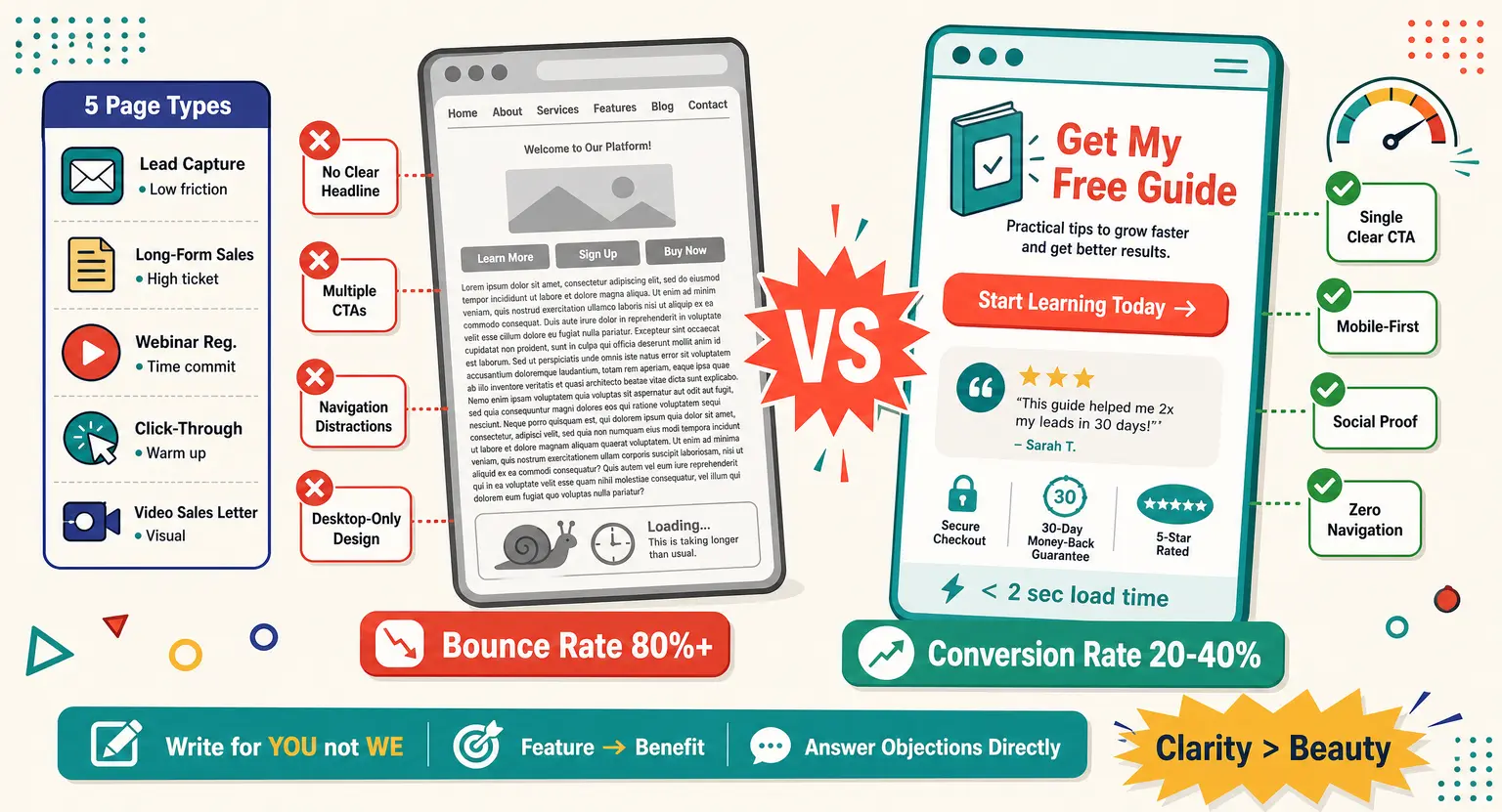
Headline Clarity : if visitors can't understand your core offering within three seconds, they will leave.
-
Single-focused Intent : every high-converting landing page needs a single, undeniable conversion goal rather than multiple options.
-
Funnel Alignment : integrate your page with your overall funnel setup to maintain audience engagement. If you need a refresher on these concepts, check out what is a sales funnel to see the big picture.
-
Continuous List Building : use landing pages as dynamic engines to gather emails. Learn how to grow an email list using simple lead magnets to sustain your business.
-
Constant Optimization : always monitor load speeds and keep mobile responsive layouts at the top of your priority list.
Crafting a Hero Section That Wins Attention Immediately
Your hero section is the digital equivalent of a billboard on a fast highway. Visitors are flying past, and you have exactly a blink of an eye to convince them to care.
A superb headline must directly answer what you offer, how it helps, and what to do next. If you write vague, overly clever taglines, your audience will simply hit the back button out of sheer confusion.
Keep your primary value proposition bold, front, and center.
Underneath the main headline, use a supportive sub-headline to elaborate on the transformation you provide. This sub-headline should hook the visitor emotionally while providing practical context.
This level of direct messaging is the foundation of high-converting sales funnels that generate revenue consistently.
But do not try to tell your entire brand story in this single space - focus only on the immediate benefit that makes staying on the page worth their valuable time.
The Anatomy of a High-Converting Call to Action
Your Call to Action (CTA) button is the ultimate focal point of your entire design - everything else on the page exists solely to guide the visitor's eyes toward this one button.
This means you must make it visually prominent and intellectually compelling. Avoid boring, generic text like 'Submit' or 'Click Here' because they carry zero emotional weight.
Instead, use benefit-driven microcopy that focuses on the positive outcome the user receives. For example, phrases like 'Get My Free Guide' or 'Start Learning Today' perform dramatically better.
And please, avoid placing multiple competing offers or buttons near each other.
Giving visitors too many paths to choose from results in decision paralysis, leading to dropped conversions.
Stick to one clear, repeating action throughout the entire page to guide them effectively. Ensure the button color contrasts sharply with your background so it is impossible to miss.
Trust Engineering : Social Proof That Converts Skeptics
Human beings are naturally skeptical when they land on a page from a brand they barely know. They are looking for reasons to leave, so you have to give them immediate, concrete proof of your credibility.
This is where strategic trust engineering comes into play to lower their natural guard. Use real, high-quality customer testimonials that focus on specific, measurable results.
Vague statements like 'This service is great' are completely useless and feel fabricated to savvy modern buyers. Instead, showcase testimonials that highlight numerical improvements or profound personal transformations.
If possible, use video testimonials because they carry immensely more authenticity than plain text.
You can also display prominent media logos, industry trust badges, or security certificates near your payment forms, but remember, do not crowd the page with too many trust seals at once... Space them out naturally so they support your messaging without feeling desperate.
Structural Comparison of High-Conversion Page Types
To help you choose the best layout for your specific campaign goals, we have organized the primary structural elements below.
|
Element name |
Optimal goal |
Best practices & details |
Friction level |
|---|---|---|---|
|
Lead Capture Page |
Gather user contact information like email addresses and names. |
Use a simple single-field or double-field form with massive headline clarity and zero distractions. Implement an intuitive how to build a sales funnel workflow to immediately deliver the opt-in bribe. |
Extremely low, requiring only a simple click or typing an email. |
|
Long-Form Sales Page |
Sell high-ticket courses, coaching programs, or complex memberships. |
Use extensive text, multiple CTA buttons, deep objection handling, FAQs, and multiple pricing grids. This requires an all-in-one marketing platform to handle secure processing seamlessly. |
High friction, which demands deep authority building and robust customer security assurance. |
|
Webinar Registration Page |
Register prospective students or clients for a live or automated teaching presentation. |
Utilize countdown timers, strict date-and-time announcements, and strong bulleted benefit lists of what people will learn. |
Medium friction, requiring users to commit their physical time to a future scheduled event. |
|
Click-Through Page |
Educate users about a specific offer and warm them up before sending them directly to a checkout page. |
Focus entirely on product benefits and visual product demos with clean CTA buttons that lead directly to cart pages. |
Low friction because visitors are not asked to pay until they reach the next step. |
|
Video Sales Letter |
Leverage highly engaging audiovisual scripts to explain complicated value propositions and drive direct purchases. |
Keep the visual layout incredibly minimalist with only a video player and a dynamically appearing CTA button below it. |
Medium friction, as users must invest several minutes watching your video pitch to get value. |
Why Mobile-First Layouts Reign Supreme in 2026
Most designers still build landing pages on a giant desktop monitor and treat mobile as a mere afterthought... But the reality is that up to eighty percent of your traffic is scrolling with their thumbs on a small screen.
If your mobile layout is clunky, slow, or difficult to read, your conversion rates will completely tank.
Because of this, you should always design for the mobile experience first before even thinking about desktop. Ensure your text fonts are large enough to read easily without needing to pinch and zoom.
Make your input forms wide and extremely easy to tap with a thumb while on the move.
Keep your visual assets lightweight so your page loads in under two seconds on a standard connection. Slow-loading pages are the absolute number one killer of conversions in our fast-paced modern world.
Every extra second of loading time causes frustrated visitors to abandon your site and go to a competitor.
Scaling Past One-Off Conversions With Funnel Integration
A landing page is never an isolated island in your marketing ecosystem - it is a vital gateway that guides users down a carefully designed customer journey.
To maximize your lifetime value, you need to seamlessly plug your pages into a larger strategy. For example, once someone grabs your lead magnet, you should immediately introduce them to your next offer.
This immediate momentum is how you build a highly successful evergreen sales funnel that generates reliable, hands-free sales.
But the mistake many creators make is letting the user experience end abruptly on the thank-you page. Instead of showing a dead end, use your thank-you page to suggest your next social channel or video.
You can also direct them to high-value resources that build deeper affinity for your brand right away.
Keep the momentum alive by sending automated email sequences that nurture their trust over time - remember, a conversion is just the starting line of a profitable, long-term relationship.
The Checklist of Unconventional High-Converting Design Rules
Let us look at some lesser-known golden rules that separate the top five percent of landing pages from the rest.
Design Hygiene Rules
-
Ditch the Navigation Menu : keep your header totally clean by removing navigation links that invite prospects to leave the page. Your only viable exit options should be closing the tab or taking the main action.
-
Honor the White Space : give your copy and visual components plenty of breathing room. Cluttered layouts overwhelm the eyes and make your critical message hard to process.
-
Vary Content Rhythm : mix up paragraphs with bullet points, icons, and blockquotes to keep readers active. Monotonous text walls encourage scanning rather than deep reading.
Cognitive Hacks
-
Single Column Flow on Mobile : stack elements vertically in a simple single-column layout so readers only scroll down. Multi-column structures on mobile cause layout shifts and logical confusion.
-
Action-Oriented Micro-Copy : label form fields with descriptive labels that make submission effortless. Instead of writing 'Email', try 'Where should we send your download?' to enhance user engagement.
The Copywriting Blueprint for High-Converting Pages
Your layout is the skeleton of your landing page, but copywriting is the actual soul.
If your text sounds like a clinical dictionary or a corporate press release, you will alienate readers instantly. You must write in the exact conversational tone your audience uses when talking to a trusted friend.
Focus heavily on the word 'you' rather than talking endlessly about 'we' or 'our product'.
Frame every feature as a direct benefit that solves a frustrating problem in their life. For example, do not just list 'high-definition video lessons' as an abstract feature on your page.
Instead, explain how they can easily follow these bite-sized video modules to master the skill in a weekend.
Addressing objections directly is another powerful copywriting technique that moves prospects toward the finish line. Think about the biggest reasons someone might say 'no' and answer them directly in your copy.
Time to Take Action and Build Your Page
Now is the time to put these principles into practice and build your own high-converting page ! Keep your layouts clean, keep your copy focused, and always optimize for the mobile visitor.
Frequently Asked Questions
How many fields should my landing page form have?
You should keep your form fields to an absolute minimum, ideally asking for just an email address to reduce entry friction.
Every additional field you add can significantly lower your conversion rates by making the sign-up process feel tedious.
Should I include a navigation menu on my landing pages?
No, you must absolutely remove all standard navigation links from your landing pages. Including a menu gives visitors too many distraction points to escape before taking your primary designed action.
How fast should my landing page load to keep conversions high?
Your landing page should load in two seconds or less on both desktop and mobile networks. Speed is incredibly critical, and any delay will cause impatient visitors to bounce immediately.
What is the difference between a landing page and a website homepage?
A landing page is built with a single focused goal and removes all external distractions to drive conversions. Conversely, a homepage acts as a broad informational hub with menus, links, and various exploration paths.
Related Resources to Scale Your Online Business
Optimization is a continuous journey that requires the right ecosystem and tools to truly pay off. If you want to dive deeper into building digital products and funnels, check out these comprehensive expert guides.
-
Step-by-Step Launch Blueprint : learn exactly how to launch an online course from scratch using modern marketing tactics that deliver results.
-
Compare Your Funnel Builder Options : if you are searching for alternative page builders, check out these top-rated ClickFunnels alternatives to find your perfect software match.
-
The Ultimate Course Hosting Guide : discover the best platform to sell online courses without tearing your hair out over complex tech integrations.
-
Price Your Content Correctly : maximize your revenue margins by crafting a killer online course pricing strategy that matches your true value.
-
Lucrative Niche Selection : brainstorm highly profitable and high-converting offers with our breakdown of the top online course ideas for your next launch.


 How to Create a Course Refund Policy (Templates & Best Practices for 2026)
 How to Create a Cohort-Based Online Course (2026 Guide)
 How to Sell an Online Course With a Quiz Funnel (2026 Guide)
 How to Sell an Online Course Through a Sales Call (2026 Guide)