


Mastering Course Workbooks: A 2026 Guide to Better Student Results
How to Create a Course Workbook
Key Takeaways
-
Active Learning : workbooks reduce the 'passive watching' trap that kills course completion rates.
-
Structure First : always outline your curriculum objectives before opening a design tool like Canva or InDesign.
-
Dual Formats : provide both fillable digital versions and high-contrast printable versions.
-
Assess Knowledge : use the workbook as a bridge to how to create quizzes for online courses to cement learning.
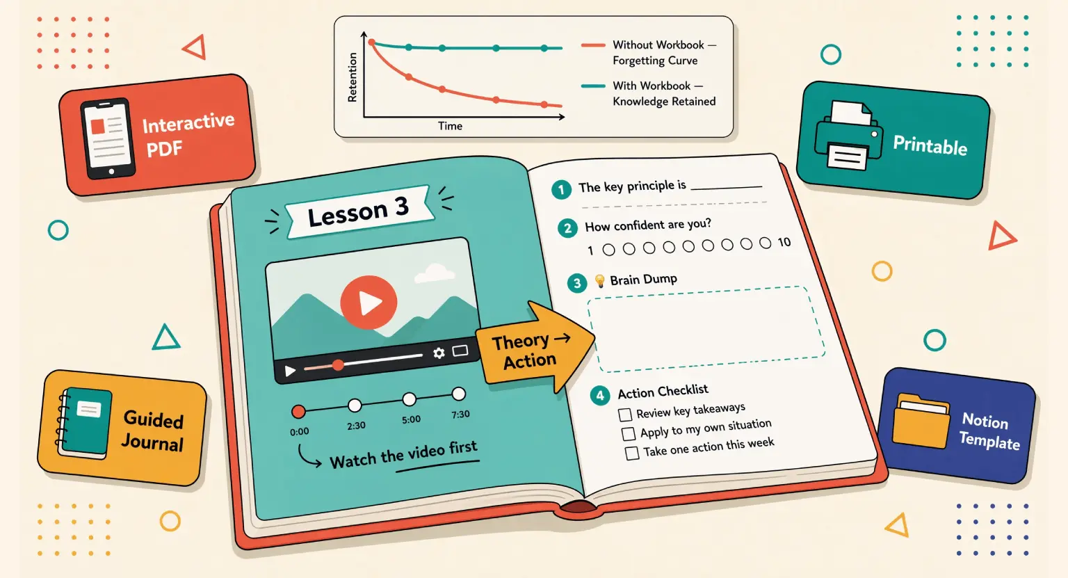
Think about the last time you sat through an online training. Did you actually change your behavior after watching the videos?
If you're like most people, you probably forgot half of the content within forty-eight hours.
That's the "forgetting curve" in action.
But there's a secret weapon that creators often ignore or throw together at the last minute : the course workbook.
It is not just some "extra" file you tack on to look professional.
It is the bridge between your theory and their transformation.
And let's be honest, we've all seen those terrible workbooks. You know the ones - thirty pages of "notes" sections where you just transcribe what the speaker said.
That is a waste of digital ink. In 2026, students expect more.
They want a guide that helps them organize their thoughts, tackle difficult tasks, and track their progress through your framework.
So, how do you build one that people actually use?
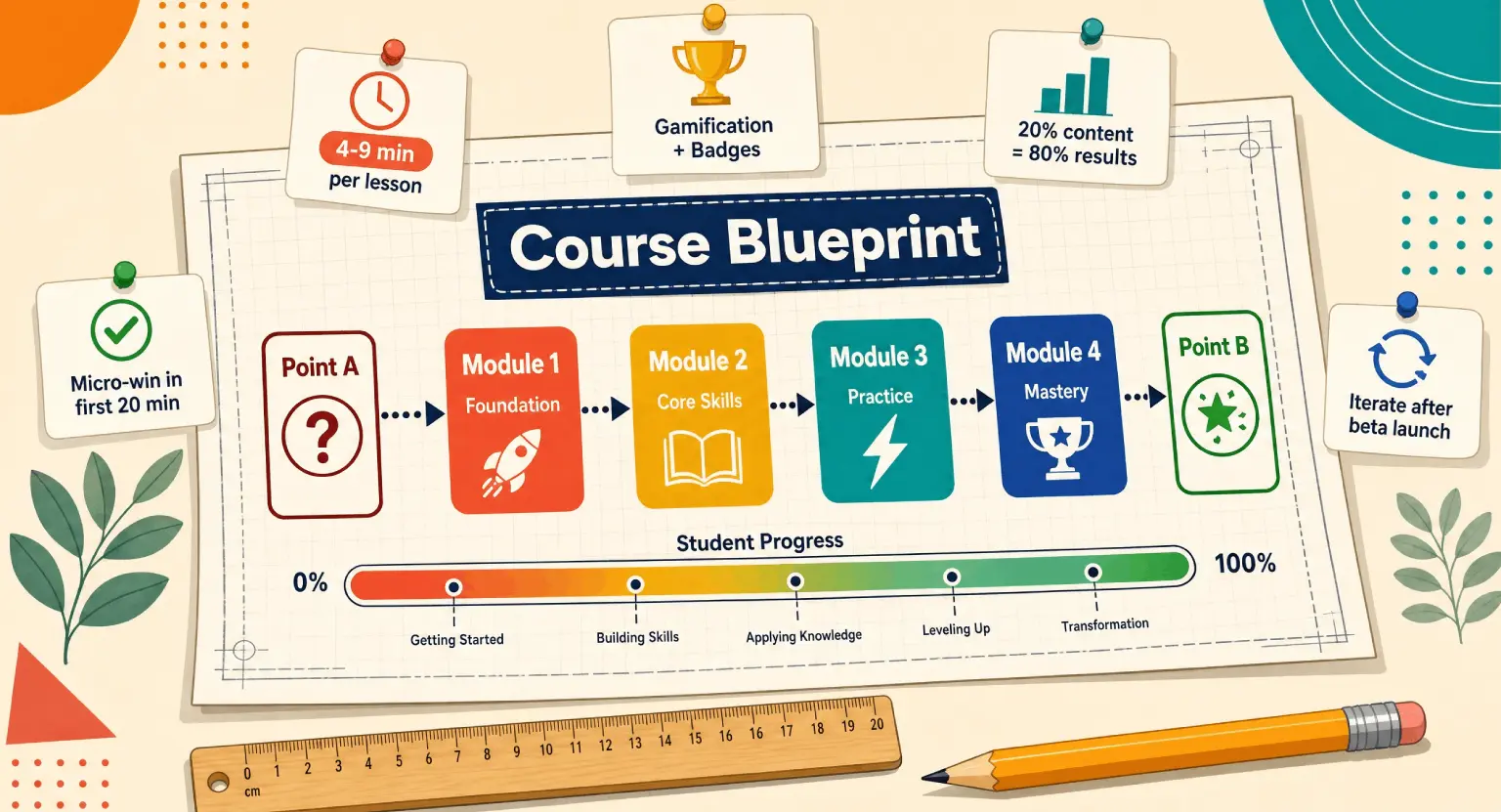
Step 1 : Mapping the Student Journey
Before you even think about colors or fonts, you need to understand what you're asking the student to do.
Every module in your course should have a corresponding task in the workbook - But wait, don't just repeat the video content.
Instead, ask yourself : "What is the one thing they need to apply right now?" If you are teaching them how to garden, the video shows them how to test soil.
The workbook should be the place where they record their specific soil pH results. It keeps them honest.
I find it helpful to look at the mistakes to avoid when creating online courses, and the biggest one is cognitive overload.
If your workbook is a giant wall of text, students will close the tab. You want to use plenty of white space.
Break things down into bite-sized prompts.
Use checklists.
Use reflection questions that force them to dig into their own specific situation.
This turns your "general" advice into "customized" results for them.
But how do you handle the technical side? You don't need a degree in graphic design. Most modern creators start with a simple outline in a Google Doc.
Once the prompts are solid, you can move to a design platform.
But don't get stuck in the "pretty" phase too early. Functionality over fashion is the motto here. If the exercise isn't clear, a fancy gold border won't save it.
Focus on the transformation first.
Step 2 : Designing for Multiple Learning Styles
People learn differently. Some of your students are digital nomads who do everything on an iPad. Others are old-school and need the tactile feel of a pen on paper.
You have to accommodate both.
When you create your workbook, ensure you are making it an interactive PDF. This means students can type directly into the boxes on their computers or tablets. It's a huge quality-of-life improvement that makes your brand look high-end.
At the same time, don't forget the printable version. Use a version with less background color to save their printer ink. Trust me, they will thank you.
If you're wondering about the cost of managing all these assets, check out the sell online courses platform pricing to see how an all-in-one solution simplifies this. You don't want to be juggling five different software tools just to deliver a PDF. You want a smooth workflow.
Let's look at a comparison of the most common workbook styles used today :
| Workbook Style | Best For | Pros | Cons |
|---|---|---|---|
| Interactive PDF | Tech-savvy students | Easy to type; very professional looking | Harder to design layout-wise |
| Printable Worksheet | Deep work sessions | Reduces screen fatigue; tactile | Students must have a printer available |
| Guided Journal | Mindset & Soft skills | Creates emotional connection | Doesn't fit technical 'how-to' topics well |
| Notion/Digital Template | Productivity courses | Highly customizable by the user | Requires students to know the software |
Step 3 : Strategic Content Placement
Now, where do you put the workbook? This is where many creators stumble.
If you give the whole thing away at the start of the course, it can be intimidating... A 50-page document looks like "homework."
Instead, I recommend breaking it up.
Put the relevant chapters under each specific module. This makes the progress feel manageable.
It's like a video game - you only get the tools you need for the level you're currently playing.
And don't forget to mention the workbook in your videos! Say things like, "Now, pause this video and turn to page four of your Action Guide."
This active cueing is vital. It reminds them that they aren't just here to watch; they are here to work.
If you're in the middle of how to launch an online course, these little details are what turn a 'good' course into a 'life-changing' one. Your students will feel supported every step of the way.
So, what should actually go inside? Think about these specific elements :
-
Fill-in-the-blank summaries of key concepts.
-
Self-assessment scales (e.g., "On a scale of 1-10, how confident are you in X?").
-
Case study analysis questions.
-
Space for brainstorming or "brain dumping."
-
Resource checklists with clickable links.
But don't just dump all your notes there. The workbook is for their thoughts, not yours.
If you want to share a lot of information, that's a textbook or an eBook. The workbook is a tool for synthesis.
You ask the question; they provide the answer.
This is the core of effective instructional design.
Step 4 : Implementation and Hosting
Once your design is finished, you need a way to get it to your students without technical glitches. This is where an all-in-one platform to sell online courses truly shines.
You can host your videos, your workbooks, and your community all in one spot. It prevents that disconnected feeling where students have to go to Dropbox for the file, then back to the site for the video.
That friction is a silent killer of engagement.
Also, consider making your workbook a lead magnet. If you're wondering how to organize a successful webinar, giving away a "Webinar Implementation Workbook" is a fantastic way to build your list.
It shows potential buyers that your teaching is structured and actionable. People buy the result, but they stay for the support.
A great workbook is a very visible sign of that support.
If you're just starting and the tech feels scary, just know that you can begin with a free LMS account to test your materials.
Get a few beta testers. Send them your workbook. Ask them : "Did this help you understand the lesson, or did it just feel like extra work?"
Listen to that feedback.
It is the only way to refine your teaching tool into something truly indispensable.
Common Pitfalls and Pro Tips
One mistake I see often is over-designing. You don't need a picture of a sunset on every page.
In fact, if the student wants to print it, they'll hate you for using all their colored ink. Keep it clean. Use your brand colors for headers, but keep the core "work" areas white with black text.
It's readable, professional, and practical. Also, make sure your font size is at least 11pt. No one wants to squint while they're trying to learn a new skill.
But the biggest tip?
Consistency.
If you use a specific icon for "Action Item" in Module 1, use that same icon throughout the whole course. This creates a visual language.
After two modules, the student doesn't even have to read the headers anymore; they see the icon and know it's time to write. This reduces the mental effort needed to navigate the material, allowing them to focus 100% on the actual content you're teaching.
Wrapping this up, remember that your workbook is a living document. As you get feedback from students, don't be afraid to tweak the questions or add new templates. It's a tool designed to serve them.
When your students feel like you've actually thought through their learning process, they become your biggest fans. And in the world of online courses, that kind of loyalty is worth more than any fancy marketing trick.
So, grab your curriculum outline, open up your favorite design tool, and start building that companion guide. Your students' success - and your course's reputation - depends on it.
You've got the expertise; now give them the tools to actually use it.
FAQ Section
Should I make my workbook a printable PDF or a digital interactive file?
In 2026, the best approach is a hybrid. You should offer an interactive PDF for tablet users and a 'printer-friendly' version for those who prefer physical handwriting.
This caters to all learning styles and increases the accessibility of your course materials.
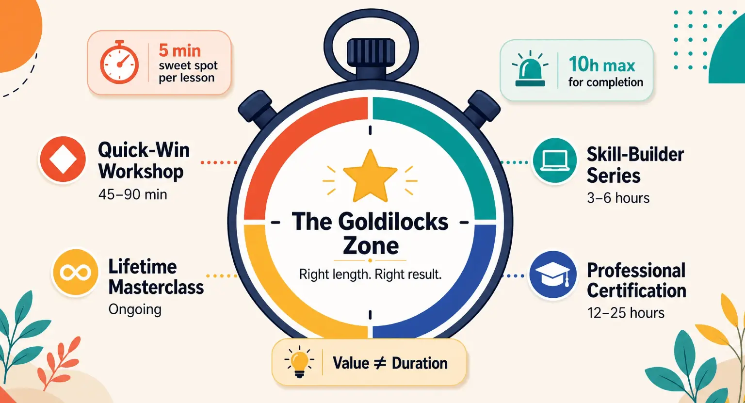
What is the ideal length for a course workbook?
Length depends on your content, but a good rule of thumb is 1-2 pages per module. You don't want to overwhelm your students with a 100-page tome.
Focus on high-impact exercises that move the needle rather than just filling space with fluff.
Can I use AI to help draft my workbook questions?
You can definitely use AI for brainstorming, but the final questions must be grounded in your unique expertise.
To avoid the generic feel of many online materials, ensure your workbook reflects your specific methodology and personal brand voice.
Where should I host the workbook download for my students?
The most effective place is right under the introductory video of each module. If you use an all-in-one platform to sell online courses, you can easily attach these files so they appear exactly when the student needs them most.


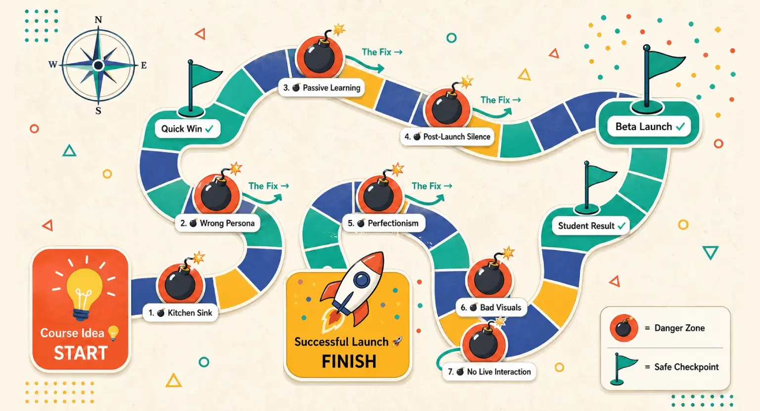 Top 7 Mistakes to Avoid When Creating Online Courses in 2026
 How to Create Quizzes for Online Courses: The 2026 Expert Guide
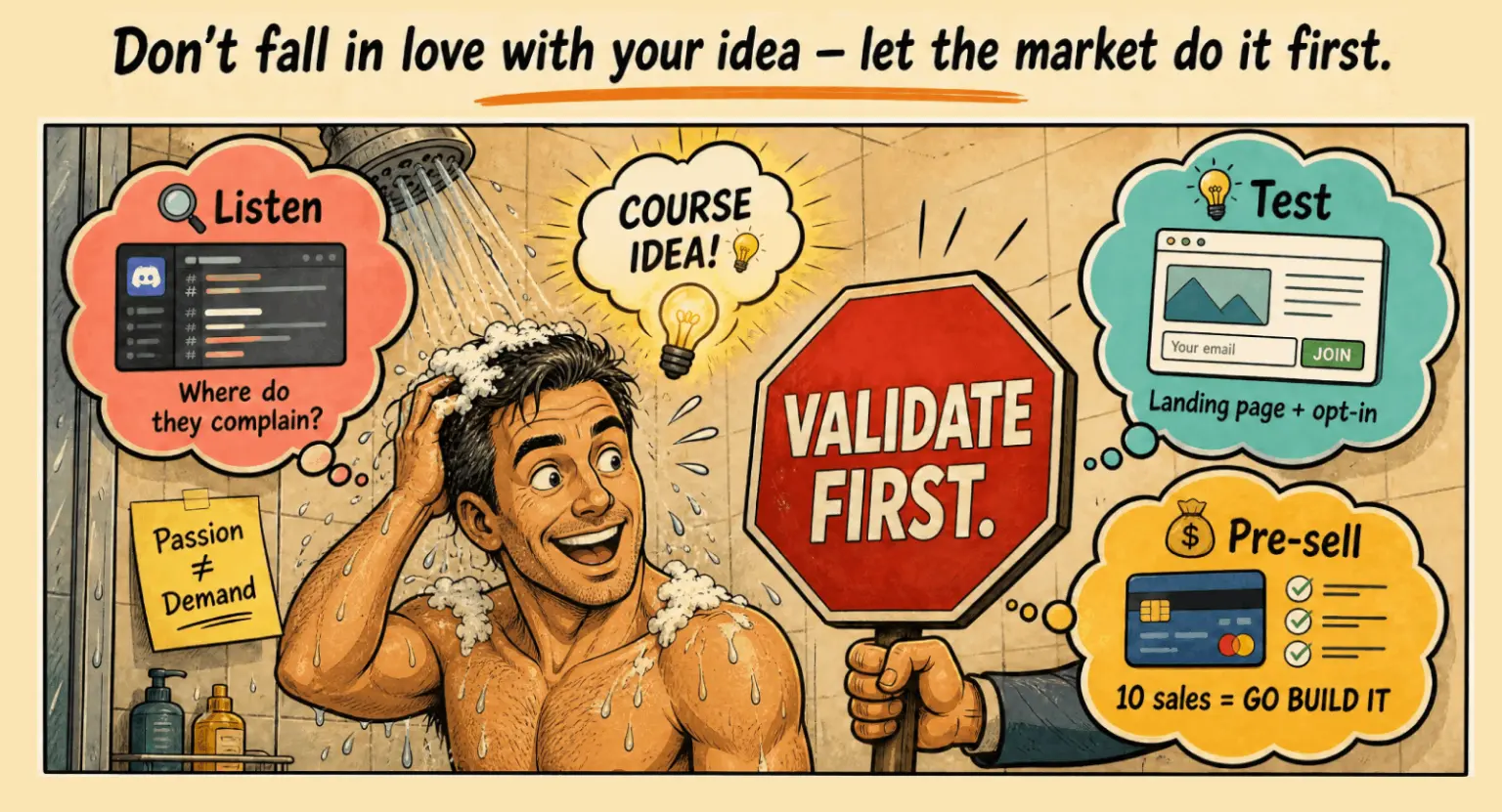 How to Validate an Online Course Idea: A Human-First Guide for 2026