







How to Create a Landing Page: Step-by-Step 2026 Blueprint
How to Create a Landing Page : Step-by-Step 2026 Blueprint
Key Takeaways
-
Building a focused platform destination is the single fastest way to transform casual web browsers into enthusiastic paying buyers. By streamlining your page message around one single conversion action, you instantly eliminate decision fatigue for your target audience.
-
Make sure to utilize a robust sales funnels model to automate the relationship-building journey from day one. Setting up your sequence works best when you integrate a specialized email marketing platform to nurture those incoming prospects.
Why Landing Pages Are Your Secret Sales Weapon
We live in a highly competitive digital age where a web visitor's attention is the most valuable currency you can earn... But many businesses waste this precious attention by sending visitors to raw, confusing homepages with too many navigation links.
That is exactly why specialized conversion pages have become the master pillars of modern, profitable online marketing strategies - and when you design a page centered around one single action, your conversion rates will dramatically reflect that intense focus.
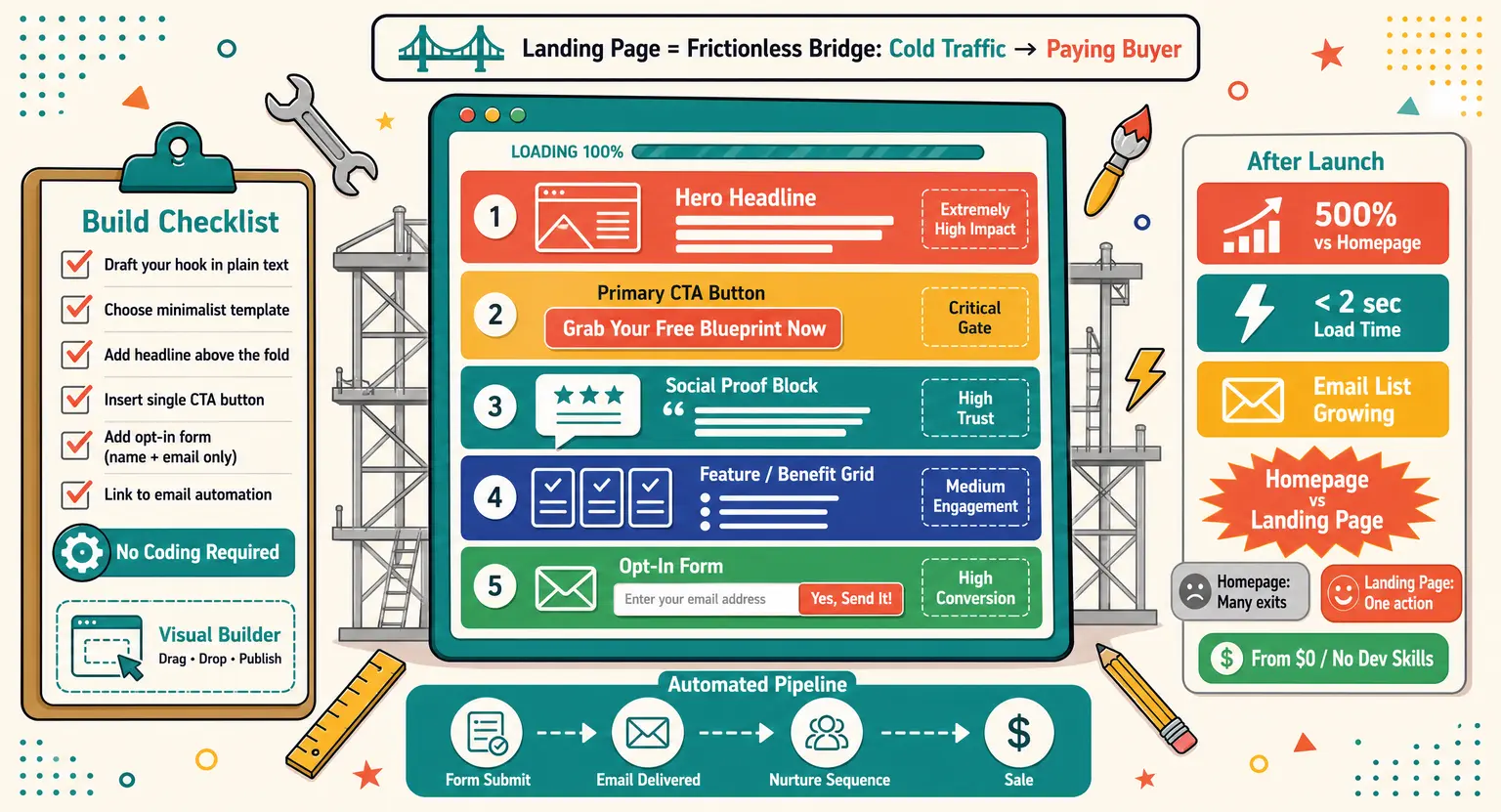
Think of your landing page as a frictionless digital bridge that takes cold traffic and turns them into excited buyers.
It completely removes the unnecessary clutter of traditional websites to let your core unique value proposition stand out brightly... But you do not need to be a coding genius or an elite designer to create landing experiences that convert !
So, we have put together this complete modern blueprint to show you exactly how to build your first profitable asset, by the time you finish studying this practical guide, you will know how to organize layouts and write ultra-persuasive body copy !
Let us start by looking at what makes a page successfully capture a visitor's interest in under three seconds.
Landing Pages vs. Homepages : The Battle of User Intent
A traditional homepage serves as an elaborate multi-purpose map that invites users to explore your brand's different directories.
While that style is excellent for general discovery, it is highly ineffective for driving immediate action on specific products.
On the other hand, landing pages are highly specialized landing pads designed for one singular marketing campaign goal. They strip away headers, footers, and sidebar widgets so that the user's attention stays glued to your core message.
For example, if you send an email campaign to a reader, you want them to buy a specific course - sending them to your homepage will only make them search through menus until they finally get tired and leave.
Thus, creating focused destinations is the ultimate key to maximizing the financial return on your daily advertising efforts.
When you eliminate distractions, you make it incredibly easy for your prospects to take the exact next step.
You also create a highly coherent transition from your original social media post or paid ad directly to your pitch - this exact alignment is why specialized layouts consistently outperform standard website homepages by over five hundred percent.
The Psychology of Designing High-Converting Visuals
Visual design speaks silently to visitors when your page loads.
If your layout is messy, people will leave before reading your message, you must ensure that your design maintains a strict visual hierarchy to direct eye movement naturally.
Keep your most compelling headers and your submit form above the fold where they are instantly visible to skimmers.
Utilizing clean, simple whitespace is another powerful technique to make your main marketing elements pop off the glass, but do not make the mistake of using random flashy animation patterns that only serve to slow downloading the page.
Rapid load times are incredibly crucial because even a single-second delay will destroy your conversion rates on mobile devices !
So, optimize your image files and keep your overall layout code clean and wonderfully lightweight for everyone.
To ensure your campaign operates perfectly, you can explore what elements form a truly high converting landing page design. This knowledge will guide your positioning decisions and help you arrange elements in an order that naturally encourages signup activity.
Always verify that your button design features high-contrast colors that clearly separate themselves from background elements. If your theme is blue for example, use an energetic orange or green button to draw immediate attention to the click.
We also strongly recommend adding subtle visual directional cues, such as arrows, that point directly toward your signup forms - these visual aids keep the reader's eye moving smoothly toward the final conversion fields as they scroll down.
Let us quickly summarize the absolute essential graphic elements you must prepare for your dynamic workspace launch :
-
A stunning, high-resolution hero image showing your digital offer on a premium mock-up display.
-
A simplified, single-column sign-up form that keeps input friction as low as humanly possible.
-
Distinct, contrasting text colors that make skim-reading your subheadings absolute child's play for mobile visitors.
-
Minimalist structural navigation that completely removes external exits, keeping users locked onto your primary value.
Copywriting Secrets : Crafting Headlines That Transform Visitors
While great visuals capture attention, it is outstanding copywriting that actually convinces a reader to take direct action today.
If you write sterile descriptions of your product features, you will struggle to capture serious emails or sales...
Instead, you should concentrate on highlighting the immediate emotional benefits and transformations your target audience desires. Focus your messages on solving their biggest problems and showing how easy their daily routine will soon become.
Your primary hero headline must state the ultimate positive result of your product or digital course clearly.
Keep it short, punchy, and completely devoid of confusing industry jargon that might alienate a rookie prospect. And you should use supportive sub-headlines to elaborate on your initial promise without cluttering the primary header area.
This dual approach gives skimmers an instant reason to spend more time exploring your core marketing layout.
To structure this flow perfectly, it helps to examine an expertly designed sales page template before writing. This template acts as a logical roadmap showing you where to place headlines, benefits, and callout sections.
Underneath your primary headers, use clean bullet points to highlight the exciting specific rewards of your program - ensure each bullet point focuses on a direct benefit rather than just listing dry technical specifications or dimensions of your digital files.
Finally, ensure your call-to-action button copy uses active verbs that make clicking feel incredibly rewarding and exciting.
Instead of writing a generic submit button, try something active like "Grab Your Free Blueprint Now to begin your journey".
Building Trust with Authentic Social Proof
Web users are skeptical of online promises, making social proof necessary to build trust. If you fail to showcase results, visitors will exit.
The most effective social proof takes the form of detailed, honest customer testimonials featuring clear, measurable metrics. Whenever possible, include a genuine headshot alongside the quote to show that a real human wrote those words.
You can also display brand logos of well-known organizations you have worked with to establish instant industry authority - this visual association acts as a trust shortcut that validates your professional competence in the eyes of new visitors.
If you want to make an impact, implementing client success metrics is easier than ever on modern, flexible pages.
Try placing these reviews right below your main hero area and immediately before your secure payment gateway fields.
Make sure never to use fake testimonials or generic reviews, as modern audiences can spot dishonesty instantly !
Real, imperfect customer feedback is always infinitely more persuasive than over-polished, artificial marketing statements written by an agency.
How to Construct a Fully Automated Lead Magnet Funnel
A great offer needs an equally powerful automated machine behind it to turn signups into long-term customer relationships - this is where setting up a structured campaign system will make your online operations smooth and highly hands-free.
When a reader inputs their contact details into your form, they are entering a smart marketing sequence. Your builder must pass this raw data directly to an integrated system to keep the communication flow seamless.
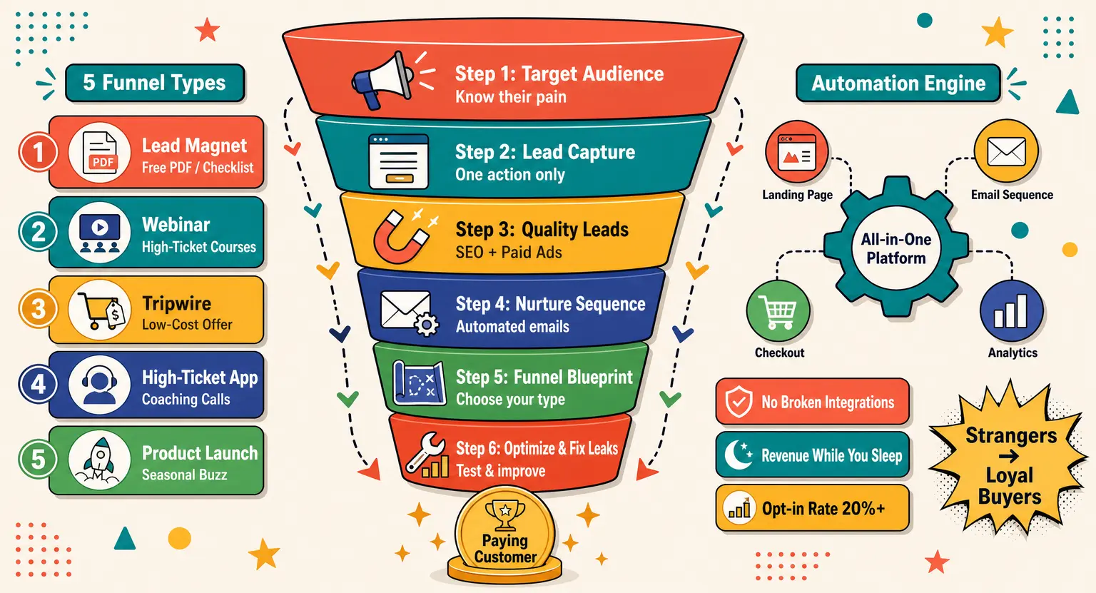
To achieve this automation, we highly recommend mapping out a strategic online lead generation funnel to handle the technical lift.
This pipeline will ensure that lead assets are delivered instantly while starting a personalized relationship sequence on autopilot.
Additionally, you should connect your opt-in system to an advanced email manager to organize your contacts automatically. This setup allows you to tag users according to their specific interests and schedule helpful follow-up emails over time.
So, your landing page is actually the vital mouth of a much larger automated digital ecosystem !
By linking these assets together, you construct a system that generates warm prospects and makes sales while you sleep.
If you want details on email copywriting, looking into email marketing for course creators will unlock a treasure trove of ideas. This knowledge ensures you write messages that drive people back to your paid checkout layouts.
Element Comparison : High-Impact Components & Intent
To help you visualize the architecture of your online pages, we created an easy comparative breakdown of key sections.
This reference grid will help you prioritize your page building process according to what drives the highest performance.
| Core element | Strategic intent | Copy style guideline | Conversion impact |
|---|---|---|---|
| Hero Headline | To capture immediate reader attention within three short seconds. | Bold, result-oriented, and highly centered on the reader's biggest problem. | Extremely High (Determines bounce rate). |
| Primary Call-To-Action | To clearly direct the visitor toward the single conversion action. | Clear, active, action-driven, and completely devoid of confusing options. | Critical (The final conversion gate). |
| Social Proof Block | To build instant trust and alleviate buyer skepticism using real feedback. | Authentic, specific customer testimonials highlighting real tangible metrics. | High (Overcomes natural purchasing friction). |
| Feature / Benefit Grid | To demonstrate the precise practical value of your special offer. | Short, punchy bullet points emphasizing direct transformation. | Medium (Keeps skimmers highly engaged). |
| Frictionless Opt-In Form | To collect essential contact details without frustrating the user. | Minimal labels that show users exactly how to fill out fields. | High (Directly affects form abandonment rates). |
Utilizing this checklist will prevent you from making classic design errors that lose money. You will ensure every pixel serves a concrete purpose in your customer conversion route.
Choosing the Perfect Technology to Build and Host
Modern marketing builders have made the process of launching custom, stunning pages incredibly fast and intuitive. But you must select an infrastructure that allows for rapid adjustments without requiring complex developer assistance.
If your main strategy revolves around education, find the best platform to sell online courses to house your entire catalog. This strategic selection will give you access to beautifully designed payment checkout pages and learning environments.
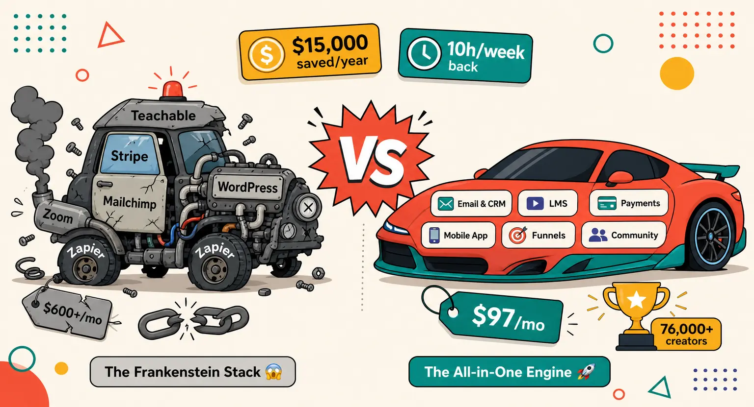
Many expert creators trust the full power of the LearnyBox platform to deliver their daily digital campaigns - this robust system unifies your landing layout, email database, secure checkouts, and student learning area on one single screen.
Utilizing an all-in-one ecosystem saves you from the painful headache of troubleshooting broken third-party marketing tool integrations... It allows you to build, test, and host every single stage of your sales funnels seamlessly.
So, before you spend weeks trying to connect different plugins, look for a system that provides unified operational speed !
This simplicity will enable you to spend more time writing persuasive copy and less time fixing broken links.
Step-by-Step Practical Creation Blueprint
Let us walk through the exact physical actions required to bring your landing layout online today.
First, you must draft your campaign hook using a plain text editor to focus purely on the power of your words.
Next, open your publishing software and select a clean, minimalist design template that matches your target goal - avoid templates with chaotic color schemes that can easily distract your target audience from your main conversion message.
Once the template loads, drop in your core benefit headline and your supportive subheadline above the page fold.
Check how this layout renders on both desktop and mobile screens to guarantee crisp legibility under any wireless network conditions.
After that, add three punchy, benefit-driven bullet points that explain the major human transformation your brand prospect will experience - keep these points short, outcomes-focused, and completely written in the active voice of a problem solver.
Now, drag in your simplified signup form and configure your single Call To Action button with high visual prominence across all platforms (keep the necessary input fields strictly limited to just a first name and email address to keep the friction barrier extremely low).
If your long-term goal is to expand your active database, study how to grow an email list for better results. This strategic approach ensures you always have a warm, growing pool of interested people ready to purchase your premium offers.
Finally, link your signup form to your digital delivery page and launch your promotional advertising campaigns immediately ! Be sure to run a quick test submission to verify that your automated autoresponder triggers perfectly for every single customer.
Launch, Analysis, and Continuous Iteration
Launching your custom page is only the first step of your sales optimization campaign. To win, check user interaction data weekly and perform simple split tests on headline variants.
If you are pre-selling a course, research our guide on how to launch an online course. These simple adjustments will double your sales and guarantee long-term asset stability.
Always study your web metric reports very closely to resolve conversion friction issues extremely early.
Frequently Asked Questions
What is the most critical landing page element?
The main hero headline is the absolute ultimate conversion driver because it must capture target reader focus in under exactly two short seconds.
Do I really need coding skills to build pages?
No, visual drag-and-drop landing page builders entirely remove tough technical barriers, allowing you to launch highly beautiful, converting sites within minutes.
Related Material
Ready to level up your entire digital marketing funnel strategy today?
-
Discover email marketing for course creators to grow your long-term organic revenue.
-
Explore how to build an email list from absolute scratch today.
These handpicked expert guides will fast-track your total digital business success.


 How to Create a Course Refund Policy (Templates & Best Practices for 2026)
 How to Run a Beta Version of an Online Course (2026 Guide)
 How to Create a Cohort-Based Online Course (2026 Guide)
 How to Sell an Online Course With a Quiz Funnel (2026 Guide)
 How to Sell an Online Course Through a Sales Call (2026 Guide)