







High Converting Landing Page: Elements & Psychology
High Converting Landing Page : Elements & Psychology (2026)
Let's face it : getting people to click a link is tough, but getting them to actually take action on your page is a whole different ballgame...
Most landing pages act like leaky buckets, letting valuable visitors slip through the cracks without a second thought.
So, how do you fix this and build something that genuinely converts? It starts with moving away from aggressive, robotic sales pitches and focusing on real human psychology.
Simply changing a headline or a button color won't save your conversion rates if the foundation is broken - you need a systematic, conversational approach that guides your reader naturally toward the finish line.
Key Takeaways for Designing a High Converting Landing Page
-
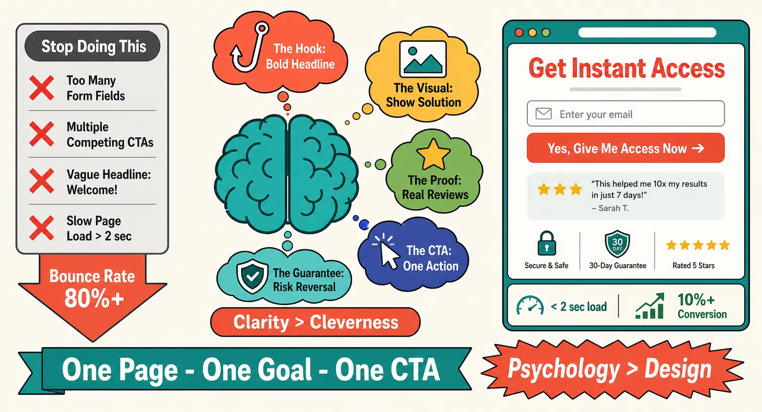
High-converting pages rely heavily on clarity rather than cleverness to establish immediate trust with the reader... Setting up a strong, persuasive framework is easier when you study a proven sales page template to see how elements flow.
-
Your call to action must stand out visually, offering a single, completely unambiguous path forward for visitors.
-
Constant micro-testing of headings and page load speed keeps your conversion rates climbing month after month.
The Core Psychology of Conversions
You cannot force someone to convert through shiny designs alone. Every visitor lands on your page with a specific set of doubts, fears, and immediate needs. If you fail to address those unspoken questions within the first three seconds, they will leave.
Trust is the baseline currency of the internet today.
So, your first job is to make your visitor feel completely understood !
Speak directly to their pain points before you even think about mentioning your product or service - but remember, clarity always triumphs over clever jargon in the online world. If a ten-year-old cannot understand what you are offering within five seconds, your copy is too complex.
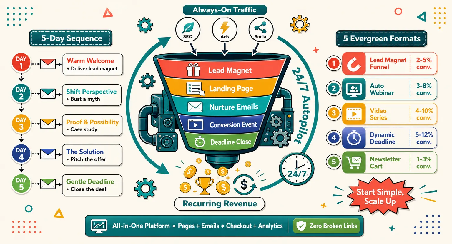
This rule applies whether you are driving traffic to a massive launch or a simple lead generation funnel aimed at capturing fresh emails.
Make every single word earn its place on the page by maintaining absolute simplicity.
Anatomy of a Landing Page That Sells
Let us dissect the actual layout that keeps eyeballs glued to the page and drives actions.
It is not about throwing every feature at your reader and hoping something sticks, instead, you should follow a highly structured sequence that mimics a natural sales conversation.
Start with an ultra-compelling hero section that states your primary value proposition.
Your subheadline must then support this promise by explaining exactly how you deliver on that claim. Keep this section clean and entirely free of distracting navigation menus that allow users to escape.
Next, list the real-world benefits of your offer rather than just piling up technical features. People do not buy software; they buy the version of themselves that is happier, faster, or richer.
And you should also display highly prominent call-to-action buttons that use active, benefit-driven language. Replace boring text like "Submit" with something inviting, like "Start My Free Trial Today."
-
The Hook : a bold, emotional headline that stops the scroll instantly.
-
The Visual : a high-quality image or short video showing your solution in action.
-
The Proof : authentic feedback from real people to build immediate credibility.
-
The CTA : a bright, contrasting button that tells the visitor exactly what to do next.
-
The Guarantee : a risk-reversal statement to ease any lingering buyer anxiety.
If you are still figuring out the basics of design, you can learn how to create a landing page that integrates all of these key elements seamlessly from day one. Taking the time to plan this layout saves hours of tedious redesigning later...
The Definitive Element Comparison Matrix
To help you prioritize your optimization efforts, we have mapped out the most critical elements of a landing page.
Notice how each component directly impacts user behavior.
|
Element name |
Primary goal on page |
Conversion impact |
Optimization priority |
|---|---|---|---|
|
Hero Headline |
Hooks the reader and states value immediately. |
Extremely High |
Highest - Always test this first. |
|
Call-to-Action (CTA) |
Directs the visitor to the next active step. |
High to Critical |
Very High - Focus on button copy and size. |
|
Trust Signals |
Reduces visitor friction and establishes authority. |
Medium to High |
High - Place authentic social proof near the top. |
|
Benefit Bullets |
Explains positive life changes for the buyer. |
Medium |
Moderate - Make these highly scannable. |
|
Hero Image/Video |
Visually displays your product or service benefits. |
Moderate |
Moderate - Ensure extremely fast loading times. |
But do not make the mistake of optimizing everything at the exact same time - pick one main element, run your test, and analyze the data before moving on to the next.
Technical Optimizations You Cannot Ignore
Even the most beautiful copy in the world will fail to convert if your page load times are sluggish.
Modern audiences expect a page to load in the blink of an eye. And if your page takes more than two seconds to load, your bounce rate will skyrocket.
Compress your images, clean up your heavy scripts, and pick a reliable, high-performance hosting platform.
Mobile responsiveness is another area where many digital marketers lose easy conversions. More than half of your traffic will likely view your page on a phone screen.
So, you must design with a mobile-first mindset from the very beginning of your project - check every button size and font line-height to ensure a smooth tapping experience.
Using a versatile sales funnels builder ensures your technical foundation remains incredibly fast and responsive across all devices. This single technical adjustment can dramatically increase your campaign ROI overnight.
Psychological Triggers That Drive Action
Human beings like to think they make perfectly logical buying decisions, but the truth is quite different... We are emotional creatures who use logic to justify emotional impulses.
So, utilizing proven psychological triggers on your page can help nudge reluctant buyers over the finish line - social proof is arguably the most powerful trigger at your disposal.
You can easily implement this by displaying real customer reviews, authority logos, or media mentions. When people see that others have successfully used your solution, their natural skepticism begins to melt away.
Another effective trigger is scarcity, but it must be used with absolute honesty. Fake countdown timers and artificial stock limits will destroy your brand credibility instantly if discovered.
Instead, offer genuine, time-sensitive bonuses or limited-capacity cohorts to encourage prompt action.
If you want to expand your reach even further, combine these tactics with an efficient email marketing platform to nurture leads who did not buy right away.
The Art of Irresistible Landing Page Copy
Writing high-converting copy is completely different from writing a scientific essay or an academic paper. You need to write exactly how your target audience talks in their daily lives.
But how do you find the exact words they use? Read through community forums, social media comments, and support tickets to capture their actual phrasing, and then, feed those exact phrases back to them in your headlines and body paragraphs.
This creates an immediate feeling of alignment, making the reader think you are reading their mind.
Focus heavily on writing clear, active headlines that promise a highly desirable, specific outcome. Avoid passive language that sounds weak and fails to inspire real movement.
This copy strategy is critical whether you are building your first digital asset or finding the best platform to sell online courses for a global audience.
Clear, empathetic writing always outperforms fancy design tricks.
Common Pitfalls that Kill Your Conversion Rates
Sometimes, increasing your conversion rate is not about adding new elements, but rather removing the friction that already exists.
Let us look at a few common mistakes that quietly destroy your sales.
-
Too Many Form Fields : asking for a phone number, address, and job title when you only need an email address is a conversion killer. Keep your forms as short as humanly possible.
-
Analysis Paralysis : offering multiple competing options or links on the same page will confuse your visitors. Stick to one clear offer per landing page.
-
Vague Headlines : headlines like "Welcome to Our Platform" say absolutely nothing. Use specific, results-oriented headlines instead.
-
Weak CTA Contrast : if your call-to-action button blends into the background color of your website, people will simply miss it. Make it pop with a bold contrasting color.
So, simplify your page structure immediately by stripping away anything that does not serve the main conversion goal. A clean, distraction-free environment is always more persuasive.
If your goal is to build long-term relationships, you should focus on simple ways to capture leads. For instance, learning how to build an email list with a clean sign-up page is far better than overwhelming visitors with too many complex offers at once.
And as you master these basics, you can discover advanced strategies on how to grow an email list exponentially without losing that personal, human touch.
Consistent refinement of your offers keeps your pipeline full of high-quality leads.
Designing the Ultimate Lead Magnet
To build a highly effective landing page, you often need an irresistible offer that visitors simply cannot refuse. This is where a high-value lead magnet comes into play.
But remember that a generic PDF guide is no longer enough to convince savvy audiences to share their contact information. To be effective, your lead magnet must solve a specific problem instantly and provide immediate gratification.
So, focus on creating high-quality action guides, checklists, or short video tutorials that offer immense, tangible value. The faster your visitor can get a small win, the more they will trust your brand.
And this trust is incredibly vital when you eventually decide how to launch an online course or introduce a premium paid product to your list.
A warmed-up audience is always infinitely easier to convert than cold traffic.
Aligning Pricing Strategy with Page Design
Your pricing presentation on your landing page can make or break the visitor's final decision. If your pricing structure is confusing, users will walk away to avoid making a mistake.
You can address this directly by presenting clear, transparent pricing options that are easy to compare. Highlight your most popular tier with a subtle design accent to guide their eyes naturally.
So, mapping out an intelligent online course pricing strategy can give you a massive competitive advantage - be extremely clear about what is included in each option, leaving no room for unexpected surprises.
Designing a high-converting page does not require any advanced technical coding expertise. It simply requires you to listen to your target audience, speak their language, and remove common friction obstacles.
So, pick one key optimization idea today, apply it directly to your digital platform, and watch your conversions climb steadily.
You truly hold all the right resources and tools that are needed to succeed in today's competitive market.
Frequently Asked Questions
What is a good conversion rate?
A good conversion rate typically hovers between three and five percent across most digital platforms. But top-performing pages often achieve rates of ten percent or higher by keeping their messaging incredibly focused.
How long should the copy be?
Your copy should be exactly as long as necessary to answer all key buying objections. Complex, expensive offers generally require longer, detailed explanations to build trust and close the deal.
Can I use video?
Yes, adding a short explainer video can boost your landing page conversion rates by up to eighty percent. But ensure your video player does not slow down your overall loading speeds.
Related Material
If you are ready to expand your knowledge, check out these excellent resources on our website today.
-
Learn much more about your options with the why LearnyBox guide.
-
View our details in the sell online courses platform pricing list.
-
Set up your workspace with a LMS free account completely free instantly.


 How to Create a Course Refund Policy (Templates & Best Practices for 2026)
 How to Run a Beta Version of an Online Course (2026 Guide)
 How to Create a Cohort-Based Online Course (2026 Guide)
 How to Sell an Online Course With a Quiz Funnel (2026 Guide)
 How to Sell an Online Course Through a Sales Call (2026 Guide)