







High-Converting Sales Page Template: The 2026 Complete Blueprint
High-Converting Sales Page Template : The 2026 Complete Blueprint
Let's be completely honest with each other for a second. We have all landed on a sales page that felt like an endless scroll of loud, flashy, empty promises and... It feels exhausting, doesn't it?
The online space has changed, and today's buyers are more skeptical than ever before.
If your current landing page template looks like a relic from the early days of online marketing, people will leave your site immediately. They can smell aggressive, manipulative copy from a mile away, and they will simply click that back button.
So, how do you fix this and convert your hard-earned traffic into paying buyers?
You need to move away from old, pushy tactics and use a design designed for modern human psychology.
Key Takeaways
-
First, clean visual layouts always defeat crowded, noisy pages.
-
Next, learning how to create a landing page with instant clarity is the single best investment you can make.
-
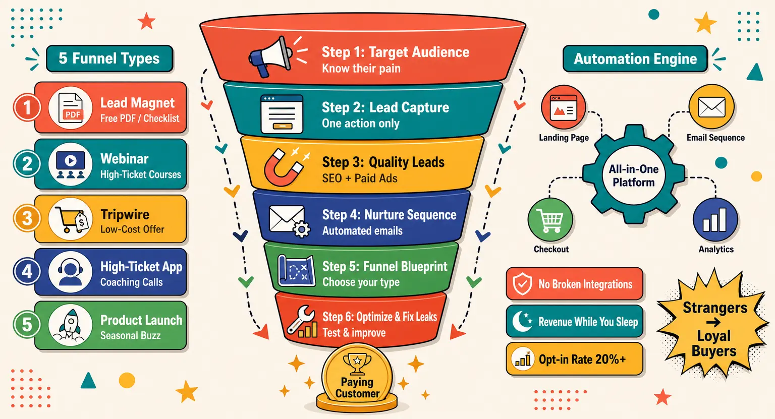
To attract organic prospects, combine this page with a strong lead generation funnel that builds interest gradually.
-
Finally, keeping your copy highly transparent is the fastest way to build lasting trust.
The Psychology of Modern Sales Representation
In the past, marketing experts told you to focus entirely on agitating pain points, they wanted you to make the prospect feel uncomfortable before offering your product as the only cure...
But that is not how healthy relationships are built today.
Modern conversion design relies on radical transparency and immediate clarity.
Your visitors want to know exactly what your offer is, who it is for, and why they should believe you.
If you make them search through blocks of tiny text for those answers, you lose them - and that is why your general layout structure matters so much, a clean design respects your prospect's time and effortlessly guides their eyes toward your call to action.
By using a structured path, you reduce the physical effort needed to read your page. When reading feels effortless, buying feels like the next logical step.
Why Most Templates Fail Today
Walk around the internet and you will find thousands of free templates that look exactly the same. They use the same generic layouts, the same fonts, and the same aggressive countdown timers that do not even work...
This creates a massive problem because your brand ends up looking completely invisible.
When you look like everyone else, you are forced to compete solely on price, which is a race to the bottom.
Furthermore, many standard templates are terribly optimized for mobile screens. If your checkout button requires users to pinch and zoom, your mobile conversion rates will crash.
Creating a highly successful digital business is about creating smooth, delightful customer interactions. Building a high converting landing page requires balancing helpful, friendly text with clean design elements.
Let's move away from templates that try to trick people into buying, and let's build something authentic that celebrates your unique offer and respects the reader instead !
The Core Anatomy of a Modern Sales Page Template
So, what does a winning structure actually look like?
It is not about using complex coding or crazy interactive tricks that slow down your server load speeds.
Instead, it relies on a series of critical structural modules stacked in a logical, persuasive order. Think of this order as a warm, face-to-face conversation with an eager customer.
You would not start a sales meeting by shouting your pricing structure, right?
You would say hello, introduce the concept, explain the benefits, show proof of success, and then explain the cost.
Let us look closely at these dynamic page elements one by one. Understanding these blocks will help you build pages that flow naturally and make sense to your visitors.
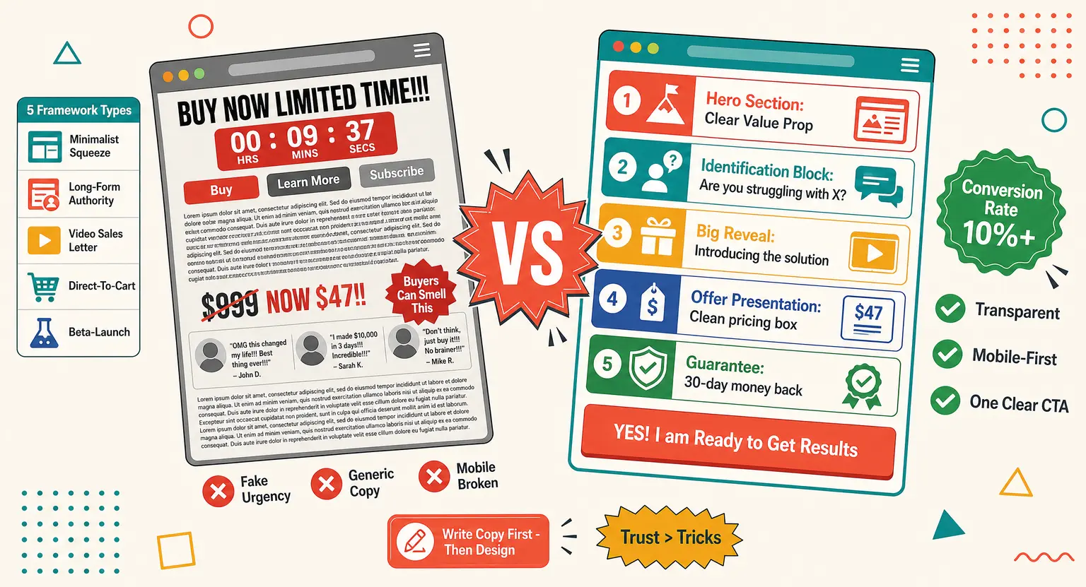
1. The Hero Section (The Instant Hook)
This is the first area your visitors see before they scroll down even a single millimeter on their device. It needs to tell them exactly what you offer and what they will gain from staying on the page.
Keep this section completely free of clutter and busy visual patterns. Use a bold, clear headline, a supportive subheading, and one dominant call to action button.
2. The Identification Block (Are They in the Right Place?)
Directly below your hero area, you must clearly identify who your solution is created for. This validates your visitor's needs and filters out people who are not a good match for your business model.
Use bullet points to quickly highlight current struggles that your target user is dealing with. When readers see their specific challenges written out, they feel deeply understood.
3. The Big Reveal (Introducing Your Solution)
Now that you have confirmed you understand their situation, introduce your product as the ultimate transformation vehicle. Avoid talking about raw product features and focus instead on outcomes.
Do not just tell them your software has three spreadsheets. Tell them your product gives them back five free hours every weekend.
A Comparison of Proven Sales Page Frameworks
Different types of offers require completely different page environments to succeed. Let's look at how structure changes depending on your goals.
| Framework name | Primary page goal | Key structural focus |
|---|---|---|
| The Minimalist Squeeze | Rapid email list growth | Very short layout with a single, highly focused opt-in field. |
| The Long-Form Authority | High-ticket program sales | Deep curriculum details, FAQ blocks, and extensive written testimonials. |
| The Interactive Video Setup | Fast-paced consumer sales | Prominent embedded media player with dynamic caption elements on top. |
| The Direct-To-Cart Layout | Quick, transactional impulsive purchases | One-page visual summary with pricing blocks sitting at the top. |
| The Beta-Launch Blueprint | Early validation of dynamic ideas | High-level outcome descriptions mixed with limited early checkout slots. |
Using the right system for your campaign keeps your visitors from getting overwhelmed. And matching your page style to your offer price is the first step toward building trust.
Key Elements That Make or Break Your Conversions
Now that we understand the structural blocks, let us discuss how to present them... Even a great layout will fail if your presentation lacks credibility.
Always place your social proof directly next to the areas where readers experience the most doubt. This includes your pricing tables and your final checkout areas.
You can find proof of our frameworks by checking out actual user feedback on our testimonials hub page. Seeing real results from real people makes your claims much more believable.
To start your business journey immediately, you can visit the LearnyBox homepage and sign up for a trial account. This lets you experiment with beautiful designs and find what works for you.
We built this tool specifically to help creators design fully integrated sales funnels without touching a single line of code. Making technology simple lets you focus on crafting the perfect copy for your audience.
4. Designing the Offer Presentation
When you present the actual offer, make it look organized.
Use clean boxes, clear icons, and bold subheadings to break down every bonus and feature included.
If your layout looks like a messy jumble of text, users will assume your product is disorganized too. Use professional spacing to let your different offer elements breathe on the screen.
Choosing between the best online course platforms depends heavily on their built-in design capabilities. You want a tool that makes modifying layouts easy.
Before choosing your structure, you should carefully plan your online course pricing strategy as it dictates your page layout. Different pricing tiers require different visual presentation styles.
5. Simplifying the Guarantee Section
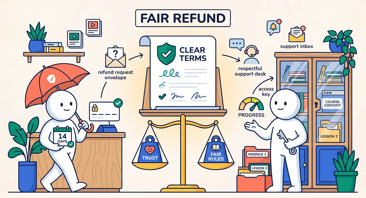
Your buyer's mind is naturally full of protective questions directly before they buy. They want to know what happens if they change their mind or if your product isn't a good fit.
Address this head-on with a simple, generous guarantee section. Write this area clearly and avoid complicated legal jargon that makes you look sneaky.
State your terms directly so there is no confusion. A bold, honest refund policy shows complete confidence in your work and puts your customers at ease.
Step-by-Step Implementation of Your Sales Template
Let's map out a simple, stress-free plan to get your new page live.
You do not need to do everything in a single day. We have seen many creators rush when they discover how to launch an online course, only to fail on their sales page structure.
Take your time to get the core pillars right first.
If you are still testing your market demand, a great approach is to learn how to pre sell an online course before you build it. This lets you fund your development while proving people actually want your offer.
If you need a shortcut to start building your actual educational material, you can use our free online course outline template to build fast and save precious design time. Having a clear structure from day one makes everything else easier...
Drafting the Copy First
Never write your copy directly inside a design tool. This leads to distracted writing because you end up constantly tweaking colors instead of focusing on your message.
Open a simple text editor and draft your headline, benefits, and checkout copy there. Once your words read beautifully on their own, move them into your page builder.
Choosing Your Colors Carefully
Your color palette should match your brand's personality, but keep things simple.
Avoid using more than three distinct colors across your page - use your brightest color exclusively for your primary buttons.
This makes it instantly obvious where users need to click to take action.
Testing Your Page Performance
Before running ads, test your page on multiple different smartphones.
Check that the text sizes are highly legible and the buy buttons are easy to tap. Even a microscopic error in your checkout flow can cost you thousands of dollars in lost sales.
Take a few minutes to run a test payment and verify everything is working perfectly.
Expert Frequently Asked Questions
How long should a standard sales page be in 2026?
The length of your page should match the complexity and price of your product. High-ticket items require more proof and deep explanations, while cheap products need short pages.
Do not write extra paragraphs just to make the page longer. Focus on giving your readers the exact amount of information they need to feel confident in their choice.
What is the single most important element of any sales template?
The headline is by far the most critical asset on your page. If your heading fails to command attention and promise clear value immediately, users will leave before scrolling.
Spend extra time testing different headline options. A simple tweak here can double your page performance overnight.
Should I display pricing immediately or keep it hidden?
Transparency is non-negotiable for modern audiences, so hiding price details creates immediate distrust. Always show your pricing clearly and include flexible payment plans.
If you are pitching a highly customized enterprise service, explain why the pricing is tailored rather than just leaving a blank space.
Can I use the same template for physical products and online courses?
No, because courses require deeper sections on curriculum structure and expert identity. Physical items rely more heavily on immediate high-resolution visuals and shipping policies.
Choose a framework designed specifically for your product type to get the best results.


 How to Create a Course Refund Policy (Templates & Best Practices for 2026)
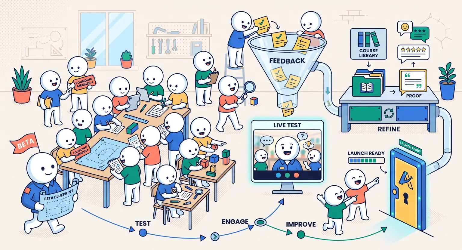 How to Run a Beta Version of an Online Course (2026 Guide)
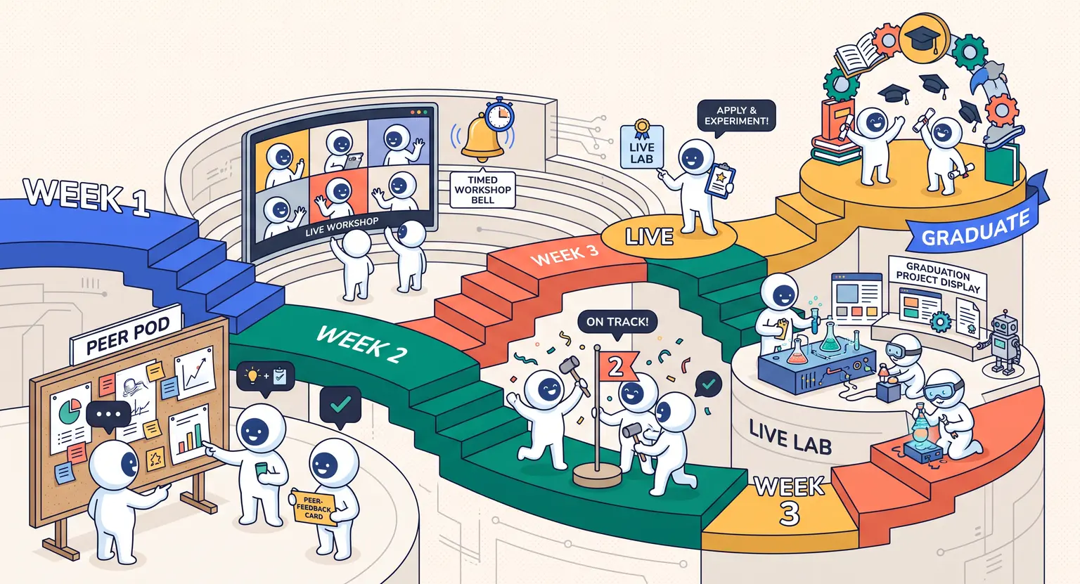 How to Create a Cohort-Based Online Course (2026 Guide)
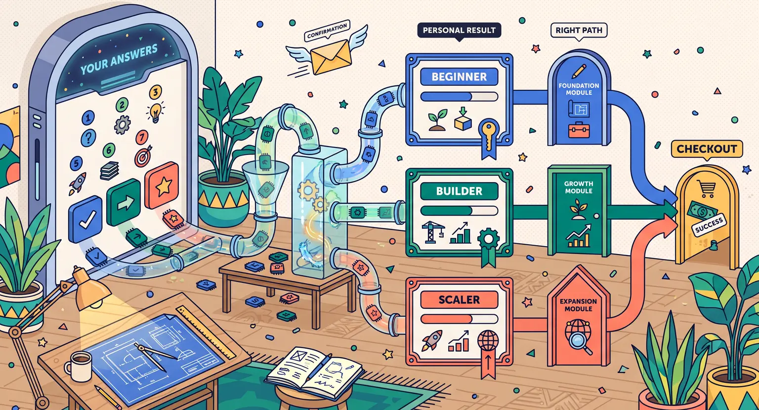 How to Sell an Online Course With a Quiz Funnel (2026 Guide)
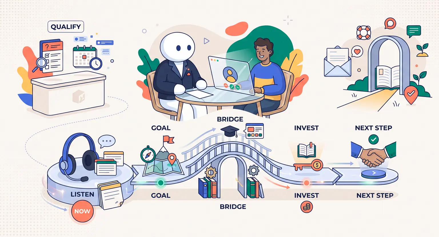 How to Sell an Online Course Through a Sales Call (2026 Guide)