







Webinar Slides Template: The High-Converting 2026 Blueprint
Webinar Slides Template
Key Takeaways :
-
The slide deck is a dynamic conversation guide : never treat your presentation slides as an exhaustive textbook. They exist solely to emphasize your spoken words and guide viewers toward your clear offer.
-
Simplification beats complexity every single time : use a clean, aesthetic format with generous breathing room. Busy backgrounds and excessive spreadsheets will only confuse viewers and spike drop-off rates.
-
Keep your final goal front-and-center : the ultimate benchmark of layout success is your conversion volume. If you want to experience effortless delivery, set up your interactive presentation straight inside our powerful, native webinars software to automate registration and streamline user handoffs.
-
Speed builds audience momentum : maintain an energetic presentation rhythm. Aim to change your visual slides every forty to sixty seconds to prevent screen fatigue and keep users completely focused on your core lessons.
Let's address the glaring problem right out of the gate : most webinar slides are absolutely painful to watch.
We have all sat through them : those tedious, text-heavy presentations with tiny fonts, boring gray bullet lists, and complex charts that look like they were pulled directly from an old-school corporate finance board meeting that drags on forever.
By minute fifteen, you are checking your email, scrolling through social media, or looking for a quick excuse to close the tab. You are not listening anymore, and you certainly are not going to purchase whatever product is being offered at the tail end of the broadcast.
But as a content creator, professional consultant, or digital entrepreneur, you cannot afford to have people drop off early…
A high-performing webinar is one of the single most reliable mechanisms on the internet for building real trust, establishing authority, and making sales - but if your presentation deck does not keep the visual rhythm lively and engaging, even the absolute best marketing strategy in the world will fall completely flat.
So how do you construct a layout that naturally holds attention from the opening hook all the way to the closing question-and-answer session?
You need a modern, visually striking structure designed specifically for the unique psychological journey of a live or recorded digital presentation.
Let's look at the proven slide blueprint that converts casual viewers into passionate buyers, helping you build massive momentum and earn higher revenues with every single broadcast you run.
The Hidden Psychology of Webinar Slides (Why Normal Decks Kill Sales)
Standard presentation files are built for documentation. Corporate templates are designed so that someone who missed the meeting can read the deck later and understand every detail… But a successful sales webinar is a completely different monster.
Your slides are not there to explain everything on their own. Instead, they are meant to visually validate what you are stating in real-time, pacing your story and providing emotional punctuation.
Think about the psychological mechanics at play when someone joins your training event :
They are sitting in front of a bright screen, surrounded by endless digital distractions,
Their browser has twelve tabs open,
Their phone is buzzing on the desk,
and their attention span is shorter than ever…
If you show them a wall of text, their brain is forced to multitask. They try to read your slides while simultaneously listening to your voice - This cognitive friction quickly fatigues their brain, leading directly to a massive drop in viewer retention.
To counteract this, your layout must emphasize micro-engagements. Every single visual shift should act as a subtle cognitive reset. This clean, visual-first format is exactly how you protect and maximize your overall webinar conversion rate when presenting online.
By minimizing the amount of text visible on screen at any given time, you pull your audience closer to your spoken words.
You want them hanging on every syllable, while your slides act as a beautiful, supportive backdrop that reinforces your main lessons without stealing the spotlight.
The Perfect 15-Slide Webinar Blueprint
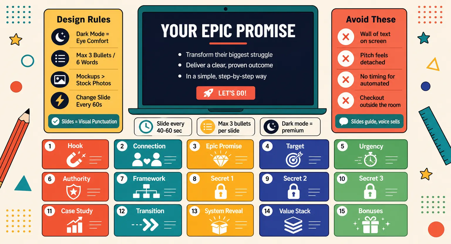
Let's get into the actual core structure. This fifteen-slide architecture is built to guide your target audience from initial curiosity directly into a focused decision-making state.
Whether you are preparing to organize a successful webinar from scratch or trying to fix an underperforming presentation, this sequential structure gives you the perfect roadmap.
Let's break down each key stage step-by-step :
-
The Hook Slide (Slide 1) : this is your title screen, but it must do more than just list a topic. It needs a massive, benefit-driven headline. Think of this slide as the book cover that makes people incredibly glad they registered for the training.
-
The Connection & Interaction Slide (Slide 2) : use this to set the housekeeping rules. Remind them to turn off notifications, participate in the chat, and stay until the end for a special bonus. This builds immediate interactive momentum and engagement.
-
The Epic Promise (Slide 3) : clearly state what they will learn over the next forty-five minutes. What is the single most valuable transformation they can expect if they stay highly focused?
-
The Target Definition (Slide 4) : explicitly qualify who this training is built for. Point out their specific pain points. When the user thinks, 'Wow, they are talking directly to me,' you have successfully earned their deeper interest.
-
The Urgency Set (Slide 5) : why is now the perfect moment to solve this problem? Detail the shifts in the industry that make standard, older methods fail.
Once you've built a solid marketing presence and know how to promote a webinar properly, this slide cements why they cannot wait to act.
-
The Story & Authority Build (Slide 6) : share your background, but do not make it an arrogant ego trip. Focus on your struggle, the exact moment you discovered the solution, and how you have helped others achieve results.
This builds immediate, relatable authority.
-
The Core Framework (Slide 7) : introduce your high-level strategy or curriculum. This acts as a bird's-eye view of the educational material to come, keeping their expectations aligned.
-
Secrets 1, 2, and 3 (Slides 8-10) : these are your primary educational pillars. Focus on refuting their limiting beliefs. Each slide should introduce a misconception, state the truth, and provide a clear real-world case study or proof point.
Keep details visual rather than using long paragraphs.
-
The Case Study & Social Proof (Slide 11) : show a visual story of someone who implemented these specific steps. Highlight the before-and-after results using dramatic text callouts and clean headshots.
-
The Transition Slide (Slide 12) : this bridges your free training content with your commercial offer. Frame it simply : 'Now you have a choice. You can take this raw information and try to figure it out alone, or you can let us help you accelerate your success.'
-
The Core System Reveal (Slide 13) : formally introduce your digital program, community, or service. Clearly list what is included, making sure every single element focuses on solving the specific pain points you discussed earlier.
-
The Stack & Value Slide (Slide 14) : visually display the complete list of everything they will receive, along with realistic values for each component. Showing the visual build-up of your program structure helps justify the final price point.
-
The Special Bonuses (Slide 15) : share your high-value fast-action bonuses to drive immediate action. Make sure these bonuses specifically solve the natural objections that arise when purchasing a new training course.
Designing for Impact : Aesthetics That Keep Audiences Glued
A structure is only as good as its final visual execution. In 2026, audience tastes have shifted dramatically toward minimalist, modern designs. The era of bright, neon gradients and stock images of businesspeople shaking hands is officially dead.
Today, clean branding, thoughtful typography, and clever whitespace are the absolute rules of high-converting slide design.
Let's focus on the essential creative rules that will make your presentation look incredibly professional :
-
Use Dark Mode Strategically : since remote viewers are watching from laptops or mobile screens, a dark background with elegant off-white text and a single accent color looks premium and is vastly easier on the eyes.
-
Keep Text Minimal : follow the rule of three. Never use more than three bullet points per slide, and keep each point under six words.
If you have more to say, simply make another slide. It costs you nothing to increase your overall slide count to maintain visual speed.
-
Integrate Quality Mockups : if you are using your slides to help launch a digital course, do not just write about your modules. Visually package them inside sleek screen mockups, showing beautifully clean tablets, phones, and printed Worksheets.
-
Incorporate Simple Milestones : break up your training by using 'divider slides' that mark the beginning of a new chapter. This signals to your viewers where you are in the journey, giving them a natural mental pause.
Before you begin designing, make sure your core content is solid - Having a clear, well-structured course outline template will save you hours of headscratching when matching slides to your modules.
And if you are still looking for inspiration on what training program to build, exploring a proven list of course niches can help you hone in on what your future audience actually wants to purchase.
Once your layout matches your educational outline, your entire presentation becomes a natural extension of your brand.
Choosing the Right Presentation Format
How do you actually build and display these slides? The software tools you choose will dictate your creation speed, sharing ability, and interactive potential. Different presentation ecosystems offer varying degrees of styling power.
Let's compare the most common formats used by serious content creators and marketers today :
| Template format | Ease of customization | Interactive features | Best for | Potential pitfalls |
|---|---|---|---|---|
|
Google Slides |
High |
Basic real-time chat integration |
Distributed teams collaborating on drafts |
Can suffer from font rendering issues across platforms |
|
Canva Pro |
Very high |
Pre-installed animations and live reactions |
Slick visual design without design skills |
Heavy exports can slow down screen-sharing tools |
|
PowerPoint (PPTX) |
Medium |
Local media embedding |
Offline control and heavy typography setups |
Difficult to manage collaborative edits smoothly |
|
Keynote (Apple) |
Medium |
Advanced layout/transition logic |
Apple users demanding professional cinema graphics |
Highly limited access for Windows co-creators |
|
Native Platform Builder |
High |
Dynamic built-in checkout buttons and live polls |
Creators running high-converting sales webinars |
Requires initial setup inside your marketing environment |
While classic slide editors like Keynote or Google Slides are wonderful for building standard business drafts, they often fail to connect your slides to your payment systems.
And if you use a unified sales funnel software system, your presentation slides become a natural, high-converting checkout experience.
You do not want your viewers to leave your presentation room to find a checkout page; you want them to buy right inside the browser window while listening to your high-value training.
Common Slide Pitfalls to Avoid
Even with a beautiful template, subtle presentation mistakes can tank your results. The single biggest pitfall is failing to decide between a live vs automated webinar setup early in your planning phase.
If your webinar is fully automated, your slide transitions must be timed perfectly with your pre-recorded voice track to prevent awkward silences,
If it's a live event, you need to leave comfortable physical and visual pauses for real-time live audience interaction and chat management.
Another massive mistake is styling with excessive raw text. Avoid pasting large paragraphs of text from your webinar script directly onto your slide layout.
Your viewers should never read ahead of your voice, as this breaks down the natural drama of your delivery.
Instead, display simple, high-impact concepts that stimulate their imagination, using high-contrast color palettes and elegant icons to anchor your verbal points effectively.
And lastly, never make your pitch feel completely detached or forced.
If you use the comprehensive LearnyBox platform to tie your high-converting presentations directly to your secure payment checkout screens, you make the commercial transition feel incredibly natural for your eager prospects.
Your slides should ease your viewers into the solution step-by-step without unnecessary friction. Your training slide deck shouldn't feel like a random university lecture followed by a desperate sales pitch - it should feel like a guided journey where investing in your course is the logical next step.
Frequently Asked Questions About Webinar Slide Templates
What is the ideal number of slides for a standard 60-minute webinar?
For a standard 60-minute presentation, aiming for 45 to 60 slides works best. This keeps things highly visual and fast-paced, allowing you to spend roughly one minute or less per slide to maintain energetic audience engagement.
Should my sales pitch slides be included in the main template design?
Yes, absolutely. Seamless styling integration keeps your pitch natural. When your sales transition slides match the clean presentation theme, your pitch doesn't look like a jarring, high-pressure shift for viewers.
Is it better to use dark backgrounds or light backgrounds for slides?
In 2026, high-contrast dark-mode slides are incredibly popular for online audiences because they reduce eye strain.
However, light backgrounds with bold contrast work equally well if you aim for a clean, minimalist academic aesthetic.
How can I keep my audience from clicking away during slide transitions?
Avoid boring, bullet-heavy layouts. Instead, design highly visual milestones, incorporate dynamic live chat cues, and maintain a fast, rhythmic flow.
Continuous visual changes prevent people from opening search tabs.
Where can I find more presentation tips for my online business?
You can find deep strategic walk-throughs and expert resources inside our extensive LearnyBox blog library to help you design, scale, and monetize your digital events successfully.






 How to Create a Course Refund Policy (Templates & Best Practices for 2026)
 How to Run a Beta Version of an Online Course (2026 Guide)
 How to Create a Cohort-Based Online Course (2026 Guide)
 How to Sell an Online Course With a Quiz Funnel (2026 Guide)
 How to Sell an Online Course Through a Sales Call (2026 Guide)